Mystery lovers face a delightful dilemma: should you read a traditional mystery novel or dive into a visually immersive graphic novel? Graphic novel mysteries are out there but few in numbers.
Each format offers a unique storytelling experience—and when it comes to uncovering clues, building suspense, and revealing the big twist, they use wildly different tools.
But which one delivers the more satisfying mystery experience? In this article, we unpack how graphic novel mysteries and classic prose mysteries handle evidence, pacing, character development, and those thrilling “aha!” moments that make the genre so addictive.
Graphic Novel Mysteries : What Makes Them Work?
A great mystery engages both mind and imagination. Whether in prose or illustrated form, the reader becomes a detective—spotting clues, tracking suspects, and forming theories.
But the medium changes everything.
Let’s compare how each handles core mystery elements: clues, characters, reveals, and pacing.
How Do Graphic Novels Present Clues Differently Than Prose?
Traditional mysteries rely on detailed narrative. Authors like Agatha Christie use description and internal monologue to slowly unravel a puzzle.
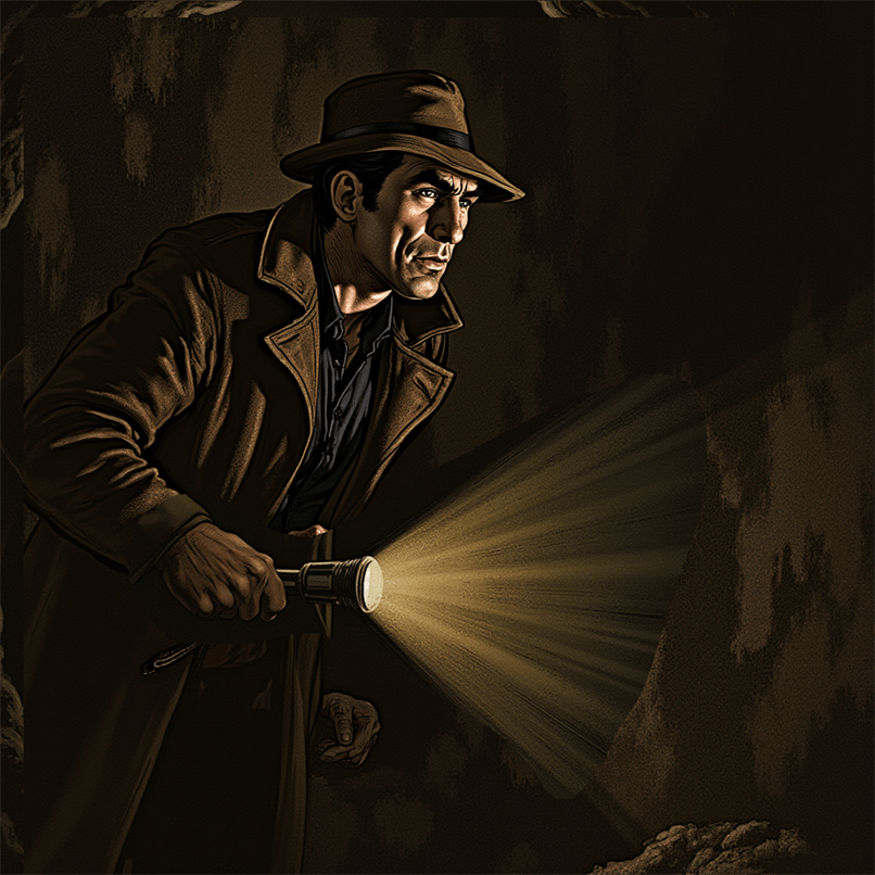
Graphic novels, however, embed clues in artwork. Think of Blacksad—visual cues like a slightly ajar door or an unnoticed item in the background become vital.
Key Difference:
Prose clues can be hidden in complex language.
Visual clues in graphic novels are immediate and often subconscious.
👉 Visual storytelling forces the reader to “see” like a detective.
Who Does Characterization Better—Words or Pictures?
Traditional mysteries give us deep psychological insight. Think The Big Sleep—we hear Marlowe’s thoughts and skepticism firsthand.
Graphic novels use visual shorthand: facial expressions, color palettes, posture. In Maus, even non-verbal cues tell stories.
Format
Character Insight
Prose
Deep, nuanced internal monologue
Graphic Novels
Instant emotion via art & design
Reader Tip: Both formats excel—just in different languages: one verbal, one visual.
The Reveal: Parlor Scene vs. Picture Drop
The classic parlor scene in prose mysteries (Sherlock Holmes, anyone?) ties everything together.
In graphic novels like Sin City, the reveal is often cinematic—a full-page spread, a panel shift, a silent reaction shot.
Prose: The detective explains.
Graphic: The story shows.
✨ Want impact? Graphic novels use pacing, layout, and silence to drop jaws.
The Role of Pacing: Which Builds Suspense Better?
Prose pacing can be manipulated with paragraph length, sentence rhythm, or chapter breaks.
In graphic novels, pacing is visual: panel size, white space, page turns.
Example: Watchmen uses slow zooms and repeated imagery for suspense.
Bottom Line:
Prose controls thought pace.
Graphics control eye pace.
World-Building & Setting: Immersion by Word or Image?
Prose Mysteries like Walter Mosley’s evoke a full sensory landscape—smell, sound, texture.
Graphic Novels show settings with immersive consistency. In The Case of the Missing Men, minor visual changes hint at major plot twists.
🔍 Want to lose yourself in a gritty alley or lavish mansion? Graphic novels make you feel present. Prose lets you imagine it.
Red Herrings & Clue Management
Both mediums employ misdirection.
Prose buries key clues in long paragraphs.
Graphic novels hide clues in background details.
In The Maltese Falcon, a throwaway line hides a critical clue. In Alias, a tiny panel detail can flip your theory.
Pro tip: Reread. Good mysteries reward second passes.
Unique Strengths of Each Format
Why Traditional Mysteries Still Reign for Deep Thinkers
Rich psychological insight
Wordplay and linguistic clues
Control over reader perspective
Why Graphic Novels Win for Immersive Detectives
Visual immediacy
Facial expression and tone
Engaging, fast-paced layout
Each format offers a different brain workout.
Graphic Novel Mysteries vs. Traditional Mysteries – Which One Solves It Better?
Truthfully? It depends on you.
Prefer deep analysis and slow-burn reveals? Stick with prose.
Want immediate clues and a visually rich experience? Choose graphic novels.
Or better yet—try both.
The perfect mystery might just be one panel or one paragraph away.
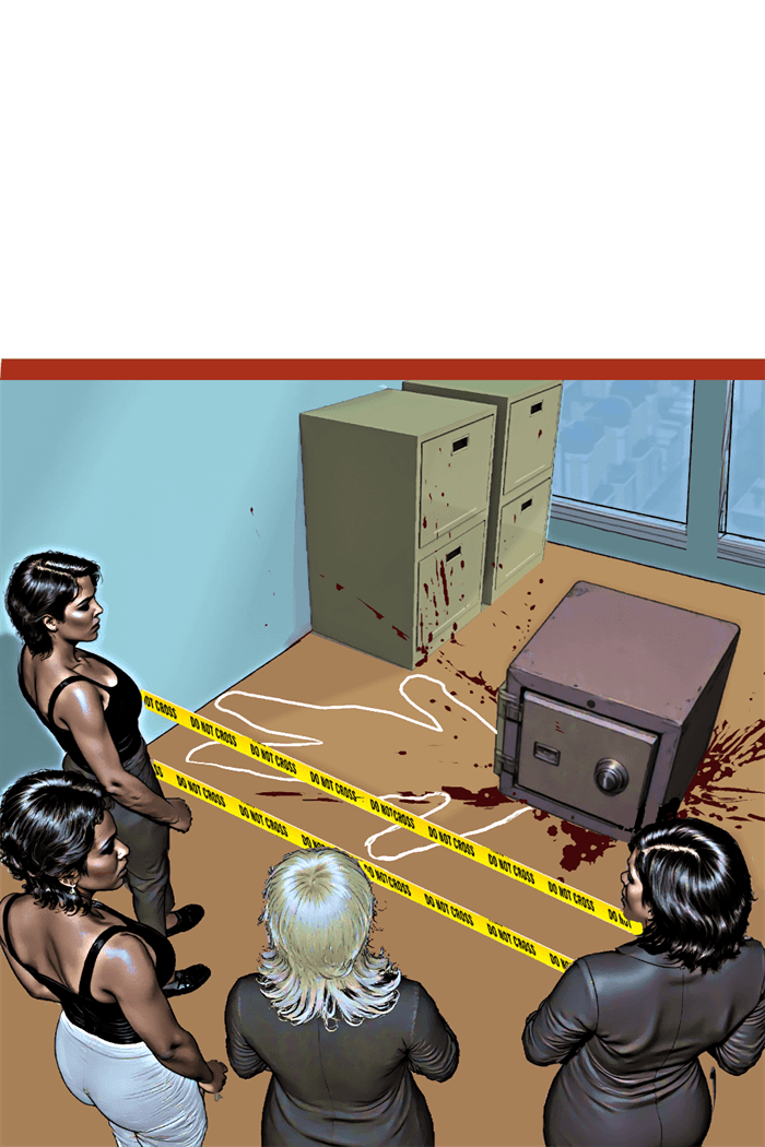
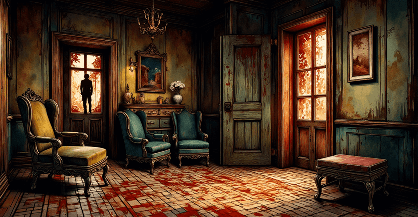
In prose mysteries, authors meticulously describe crime scenes to plant clues, establish atmosphere, and ground readers in the reality of the investigation. Mystery graphic novels face a unique challenge—and opportunity—by making these descriptions visual. The illustrator becomes both scene-setter and clue-planter, using visual details to simultaneously engage, mislead, and inform readers. This visual dimension transforms how mysteries unfold and how readers interact with the investigative process.
The Reader as Active Investigator
Unlike prose where authors control exactly what information readers receive through description, graphic novels present entire scenes at once. This shifts readers from passive recipients to active investigators who must decide:
Which details to focus on
What might be significant versus decorative
How to interpret visual information without textual guidance
This relationship mirrors the actual detective process, turning readers into de facto investigators examining the scene alongside the protagonist. Artists like Dave Gibbons (“Watchmen”) and Eduardo Risso (“100 Bullets”) exploit this dynamic by embedding crucial clues within richly detailed panels that reward scrutiny but don’t immediately announce their significance.
Visual Continuity and Contradiction
Crime scene details in graphic novels serve another crucial function: establishing consistency and continuity. Readers can verify whether elements appear, disappear, or change position across panels—details that may signal:
The passage of time
Evidence tampering
Unreliable narration
Character observations
In Jeff Lemire and Andrea Sorrentino’s “Gideon Falls,” the mysterious Black Barn changes subtly across appearances, with tiny inconsistencies hinting at its impossible nature. Similarly, in “From Hell,” Eddie Campbell’s detailed Victorian London settings maintain meticulous consistency except when deliberately broken to suggest supernatural elements or perceptual shifts.
The Three Tiers of Detail
Effective mystery illustrators typically work with three levels of visual information:
1. Narrative Necessities
These are the elements required to understand basic story progression—the corpse, the weapon, the detective’s actions. They’re typically prominently featured and clearly rendered.
2. Contextual Enrichment
These details establish setting, time period, and atmosphere, creating the world in which the mystery unfolds. They enhance immersion without necessarily providing clues.
3. Investigative Triggers
These are the subtle details that matter to the mystery’s solution—a misplaced object, an inconsistent shadow, an unusual angle. They may initially blend with contextual details but become significant later.
François Schuiten’s architectural precision in “The Theory of the Grain of Sand” exemplifies this tiered approach. His elaborately detailed buildings contain both contextual richness and carefully placed anomalies that become central to the unfolding mystery.
The Forensic Panel: Technical Precision in Service of Story
Some graphic mysteries employ what might be called “forensic panels”—highly detailed, often zoomed-in views of crime scene elements that invite readers to examine evidence as a detective would. These panels serve multiple functions:
Highlighting potentially important clues
Creating rhythm by slowing narrative pace at crucial moments
Building tension through visual emphasis
David Finch’s work on “Batman: The Dark Knight” exemplifies this technique, using extreme detail in evidence-focused panels while employing more expressionistic styles for action or emotional beats. This visual shift signals to readers when to engage their analytical faculties.
Color as Investigative Tool
Color in mystery graphic novels isn’t merely aesthetic—it functions as an investigative element. Color can:
Code timelines (different color palettes for different time periods)
Flag connections (linking seemingly unrelated scenes through color motifs)
Signal emotional undercurrents (using psychological color effects)
Highlight key evidence (selective color emphasis in otherwise muted scenes)
Dave Stewart’s coloring in “Blacksad” demonstrates this approach, using distinct color temperatures for different locations and character associations while maintaining noir-inspired shadows that obscure certain details until they become relevant.
Case Study: “Stumptown” and Environmental Storytelling
Greg Rucka and Matthew Southworth’s “Stumptown” exemplifies masterful crime scene detail work. Consider how they handle investigative environments:
Location-specific details that ground the story in Portland, Oregon’s authentic geography
Weather effects that influence both the crime and its investigation
Environmental degradation that reflects case progression
Character-revealing interactions with scene elements
Southworth’s detailed backgrounds aren’t merely decorative—they’re narrative tools containing potential clues, red herrings, and character insights. A discarded lottery ticket in one panel might become crucial evidence three issues later, rewarding attentive readers while maintaining narrative integrity.
The Burden of Realism vs. Stylization
Mystery graphic novelists face a particular tension between realism and stylization. Too realistic, and crucial details might be lost in visual noise; too stylized, and the mystery might seem arbitrary rather than fair-play. Different artists resolve this tension in distinctive ways:
Sean Phillips (“Criminal”) uses a gritty realism with selective detail emphasis, focusing readers on key elements through composition and lighting
Jock (“Detective Comics”) employs expressionistic shadows and selective detail to highlight emotional and evidentiary focal points
Darwyn Cooke (“Parker” series) uses mid-century minimalism that makes any detailed element immediately significant by contrast
Each approach creates different reader expectations about how visual information relates to the mystery’s solution.
Digital vs. Traditional Approaches to Detail
The digital revolution has transformed how crime scene details function in mystery comics:
Traditional Media Advantages
Textural variations can suggest material properties relevant to crimes
Media-specific effects (ink spatters, watercolor bleeds) can mimic crime scene elements
Precision detail can be maintained consistently across panels
Zoom functions allow readers to examine minute details
Layer effects can subtly highlight or obscure elements
Chris Samnee’s work in “Black Widow” demonstrates a hybrid approach, using traditional techniques for organic elements while leveraging digital precision for technological details central to espionage-focused mysteries.
Teaching Readers How to Read the Scene
Sophisticated mystery graphic novels often “train” readers in how to interpret their visual language. Early chapters may explicitly highlight details that solve minor mysteries, establishing a visual grammar readers can apply to more complex puzzles later. This educational aspect creates a deepening relationship between creator and audience.
Brian Michael Bendis and Michael Avon Oeming’s “Powers” exemplifies this approach. Early cases feature explicit visual callbacks to previously established clues, training readers to recognize the significance of certain details, angles, and visual motifs that become more subtle as the series progresses.
Practical Techniques for Mystery Illustrators
For creators working in the mystery graphic novel space, certain techniques have proven particularly effective:
Consistent object placement that allows readers to track items across scenes
Architectural precision that prevents spatial cheating
Character-specific environmental interaction where different characters notice or interact with different details
Visual callbacks that link current scenes to earlier, seemingly unrelated moments
Progressive revelation where panels revisit locations with new details visible
These techniques maintain the “fair play” ethos central to mystery fiction while exploiting the unique possibilities of visual storytelling.
Conclusion
In the best mystery graphic novels, every shadow, object placement, and background detail potentially matters. The crime scene becomes not merely a backdrop but an active participant in the narrative—a visual puzzle that readers must solve alongside the protagonist.
This visual dimension transforms the traditional mystery from a game played primarily in the mind to one that engages multiple cognitive systems—pattern recognition, spatial awareness, color perception, and narrative sequencing. The illustrator becomes both the mystery’s architect and its gatekeeper, using visual details to create a labyrinth that’s challenging enough to engage but fair enough to solve.
For readers, this visual element adds a unique dimension to the mystery experience. When the detective finally explains the solution, the best graphic mysteries allow us to flip back through pages and see what was hiding in plain sight all along—not described but shown, waiting patiently in the background for us to notice what was always there.
In the world of mystery comics, color isn’t just decorative—it’s narrative. While the written word relies on descriptive language to set a scene’s mood, comics have the unique advantage of using color palettes to instantly communicate atmosphere, emotion, and even subtle clues.
The strategic use of color can transform a simple detective story into an immersive psychological experience, guiding readers through the fog of mystery toward (or sometimes away from) the truth.
The Psychology of Color in Mystery
Before examining specific works, it’s worth understanding how different color schemes affect readers on a psychological level:
Monochromatic schemes (variations of a single color) create cohesion and often suggest a singular, focused perspective
Complementary colors (opposite on the color wheel) create visual tension that mirrors narrative conflict
Analogous palettes (colors adjacent on the wheel) build harmony that can be strategically disrupted to signal danger
Desaturated colors suggest the past, memory, or unreliability
High contrast heightens drama and emphasizes divisions between characters or concepts
Mystery comics leverage these principles not just for aesthetic appeal but as sophisticated storytelling tools.
Noir Traditions and Their Evolution
Classic noir-inspired mystery comics traditionally embraced high-contrast black and white or limited color palettes. Works like Frank Miller’s “Sin City” strip color away almost entirely, using stark blacks and whites with occasional splashes of color (a woman’s red dress, yellow skin) to highlight elements crucial to the narrative.
Modern mystery comics have evolved this approach. Consider how Sean Phillips’ coloring in “Criminal” and “The Fade Out” uses muted, desaturated tones punctuated by vibrant accents. This technique creates a world that feels simultaneously grounded in reality yet slightly removed—perfect for stories where truth is elusive.
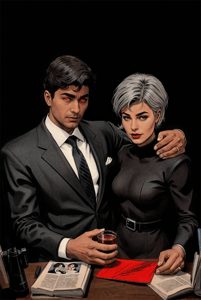
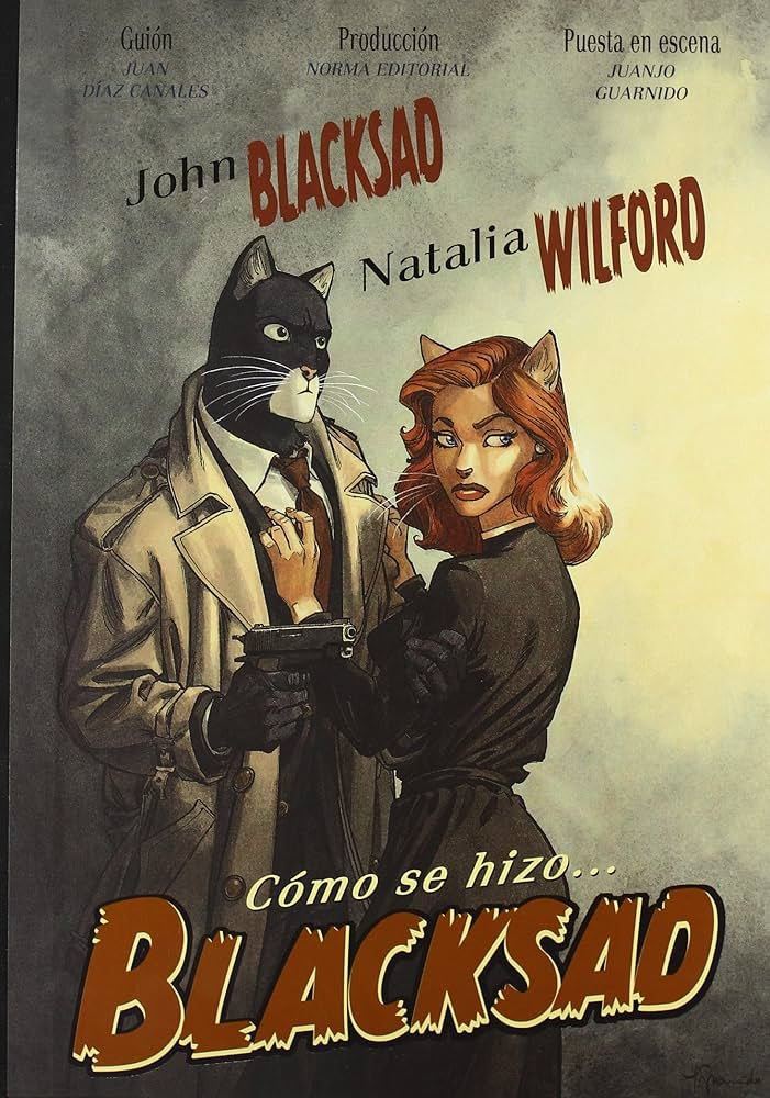
Case Study: “Blacksad” by Juanjo Guarnido
#image_title
Perhaps no mystery comic demonstrates color mastery better than “Blacksad.” Guarnido’s watercolor technique allows for:
Environmental storytelling – Rainy scenes use cool blues and grays to convey melancholy, while corrupt settings often feature sickly yellows and browns
Character coding – Protagonist John Blacksad’s black fur contrasts with white facial markings, visually representing his moral ambiguity
Temporal shifts – Flashbacks use warmer, sepia-toned palettes to distinguish them from the cooler-toned present
Emotional progression – As mysteries unravel, color schemes gradually shift, sometimes brightening as truth emerges or darkening as dangers increase
The anthropomorphic characters also allow for color symbolism through species selection—red foxes for seductive characters, reptiles in cold greens for calculating villains.
Using Color to Hide and Reveal
In “Daytripper” by Fábio Moon and Gabriel Bá, color palette shifts signal alternate realities and outcomes in what becomes an existential mystery. The reader learns to track these subtle changes as clues to which timeline they’re witnessing.
Jeff Lemire and Andrea Sorrentino’s “Gideon Falls” employs dramatic color contrasts—particularly bold reds against desaturated backgrounds—to highlight elements connected to its central mystery. The color red becomes a visual trigger warning readers of the supernatural threat’s presence even before characters recognize it.
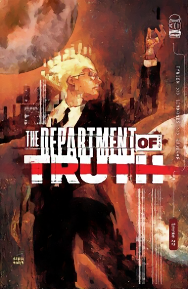
The Unreliable Palette
#image_title
Just as mystery novels may feature unreliable narrators, mystery comics can use “unreliable palettes” that reflect characters’ perceptions rather than objective reality:
In “The Department of Truth,” Martin Simmonds uses unstable, painterly color that warps and shifts, visually representing how conspiracy theories distort reality
“Mister Miracle” by Tom King and Mitch Gerads employs color glitches and inconsistencies that subtly suggest something is wrong with the protagonist’s perception
David Mack’s “Cover” uses different artistic styles and associated color approaches to represent the dual worlds of espionage and comics creation
Suspense Through Color Progression
Mystery comics often employ color progressions that build suspense:
The narrowing palette – Colors gradually reduce to a minimal scheme as focus intensifies
The contamination technique – A color associated with danger or a villain slowly “infects” previously safe environments
The reveal enhancement – Major revelations accompanied by dramatic palette shifts
Matt Fraction and Chip Zdarsky’s “Sex Criminals” uses glowing rainbow colors to represent “the Quiet,” a time-stopping phenomenon. This color scheme becomes a suspenseful signal throughout the series—when these colors begin to appear, readers know a significant shift is imminent.
Digital Innovation
Digital coloring has expanded the mystery colorist’s toolkit:
Gradient mapping allows for subtle mood transitions impossible in traditional coloring
Texture overlays can suggest film grain for noir homages or paper texture for period mysteries
Lighting effects create spotlight effects that focus reader attention on key elements
Jordie Bellaire’s coloring in “The Vision” by Tom King demonstrates how digital techniques can create an unsettling suburban palette that feels simultaneously bright and hollow—perfect for a mystery about artificial beings attempting to mimic human life.
Cultural Color Considerations
Mystery comics increasingly acknowledge that color symbolism varies across cultures:
White, associated with purity in Western contexts, signifies death in many Eastern cultures
Red might represent danger in one context but good fortune in another
The emotional weight of specific colors shifts across cultural boundaries
Global mystery series like “Monster” by Naoki Urasawa consider these differences, using color in ways that respect the settings of their international narratives.
Practical Applications for Creators
For comic creators working in the mystery genre, color provides powerful tools:
Establish a baseline palette that represents “normal” before introducing disruptive elements
Create color motifs linked to specific characters, allowing for subtle implication through color alone
Use color timing to pace revelations—a sudden palette shift signals importance
Employ strategic desaturation to suggest unreliability or past events
Control reader focus through selective color emphasis
The Upshot
In mystery comics, color isn’t merely decorative but functionally narrative. The most compelling graphic mysteries use color strategically, creating visual atmospheres that guide readers through complex emotional terrain while simultaneously embedding clues and misdirections.
As printing technology and digital coloring continue to evolve, so too will the sophisticated ways mystery comics leverage color to conceal and reveal, building suspense one carefully chosen hue at a time.
The next time you pick up a mystery comic, pay attention not just to what the characters say or do, but to the colors that surround them—they’re telling a story all their own.