In prose mysteries, authors meticulously describe crime scenes to plant clues, establish atmosphere, and ground readers in the reality of the investigation. Mystery graphic novels face a unique challenge—and opportunity—by making these descriptions visual. The illustrator becomes both scene-setter and clue-planter, using visual details to simultaneously engage, mislead, and inform readers. This visual dimension transforms how mysteries unfold and how readers interact with the investigative process.
The Reader as Active Investigator
Unlike prose where authors control exactly what information readers receive through description, graphic novels present entire scenes at once. This shifts readers from passive recipients to active investigators who must decide:
- Which details to focus on
- What might be significant versus decorative
- How to interpret visual information without textual guidance
This relationship mirrors the actual detective process, turning readers into de facto investigators examining the scene alongside the protagonist. Artists like Dave Gibbons (“Watchmen”) and Eduardo Risso (“100 Bullets”) exploit this dynamic by embedding crucial clues within richly detailed panels that reward scrutiny but don’t immediately announce their significance.
Visual Continuity and Contradiction
Crime scene details in graphic novels serve another crucial function: establishing consistency and continuity. Readers can verify whether elements appear, disappear, or change position across panels—details that may signal:
- The passage of time
- Evidence tampering
- Unreliable narration
- Character observations
In Jeff Lemire and Andrea Sorrentino’s “Gideon Falls,” the mysterious Black Barn changes subtly across appearances, with tiny inconsistencies hinting at its impossible nature. Similarly, in “From Hell,” Eddie Campbell’s detailed Victorian London settings maintain meticulous consistency except when deliberately broken to suggest supernatural elements or perceptual shifts.
The Three Tiers of Detail
Effective mystery illustrators typically work with three levels of visual information:
1. Narrative Necessities
These are the elements required to understand basic story progression—the corpse, the weapon, the detective’s actions. They’re typically prominently featured and clearly rendered.
2. Contextual Enrichment
These details establish setting, time period, and atmosphere, creating the world in which the mystery unfolds. They enhance immersion without necessarily providing clues.
3. Investigative Triggers
These are the subtle details that matter to the mystery’s solution—a misplaced object, an inconsistent shadow, an unusual angle. They may initially blend with contextual details but become significant later.
François Schuiten’s architectural precision in “The Theory of the Grain of Sand” exemplifies this tiered approach. His elaborately detailed buildings contain both contextual richness and carefully placed anomalies that become central to the unfolding mystery.
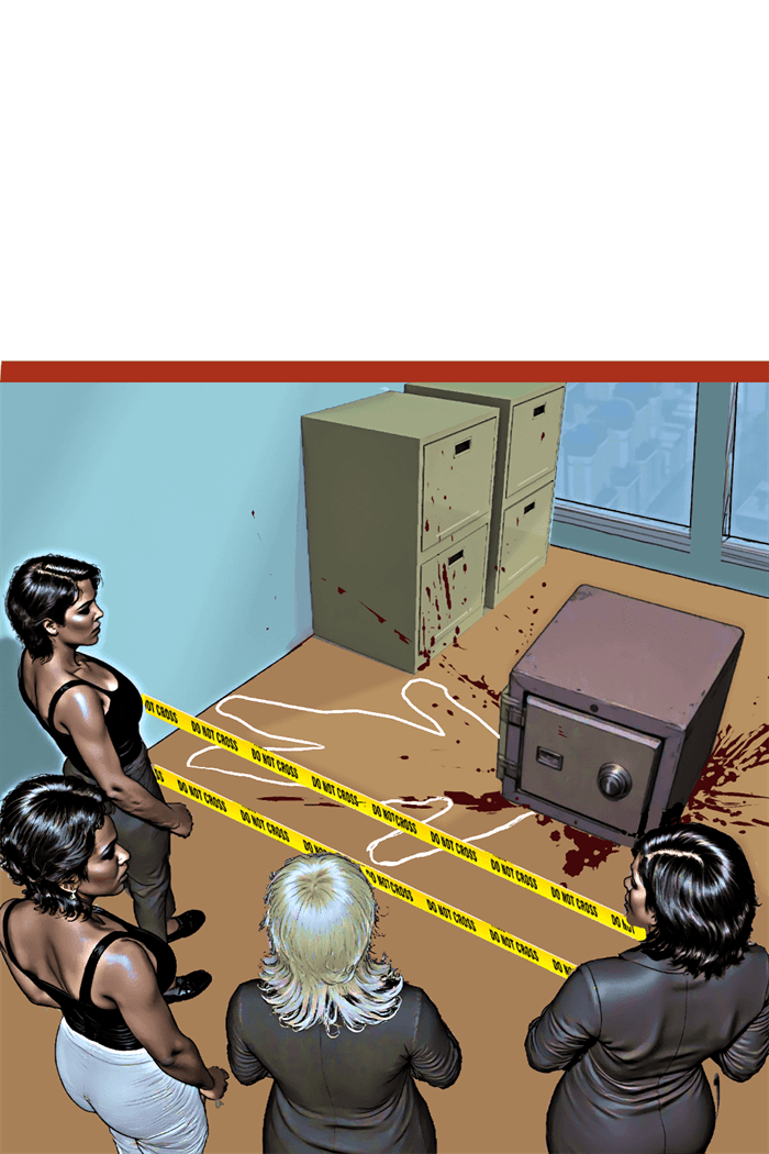
The Forensic Panel: Technical Precision in Service of Story
Some graphic mysteries employ what might be called “forensic panels”—highly detailed, often zoomed-in views of crime scene elements that invite readers to examine evidence as a detective would. These panels serve multiple functions:
- Highlighting potentially important clues
- Creating rhythm by slowing narrative pace at crucial moments
- Building tension through visual emphasis
David Finch’s work on “Batman: The Dark Knight” exemplifies this technique, using extreme detail in evidence-focused panels while employing more expressionistic styles for action or emotional beats. This visual shift signals to readers when to engage their analytical faculties.
Color as Investigative Tool
Color in mystery graphic novels isn’t merely aesthetic—it functions as an investigative element. Color can:
- Code timelines (different color palettes for different time periods)
- Flag connections (linking seemingly unrelated scenes through color motifs)
- Signal emotional undercurrents (using psychological color effects)
- Highlight key evidence (selective color emphasis in otherwise muted scenes)
Dave Stewart’s coloring in “Blacksad” demonstrates this approach, using distinct color temperatures for different locations and character associations while maintaining noir-inspired shadows that obscure certain details until they become relevant.
Case Study: “Stumptown” and Environmental Storytelling
Greg Rucka and Matthew Southworth’s “Stumptown” exemplifies masterful crime scene detail work. Consider how they handle investigative environments:
- Location-specific details that ground the story in Portland, Oregon’s authentic geography
- Weather effects that influence both the crime and its investigation
- Environmental degradation that reflects case progression
- Character-revealing interactions with scene elements
Southworth’s detailed backgrounds aren’t merely decorative—they’re narrative tools containing potential clues, red herrings, and character insights. A discarded lottery ticket in one panel might become crucial evidence three issues later, rewarding attentive readers while maintaining narrative integrity.
The Burden of Realism vs. Stylization
Mystery graphic novelists face a particular tension between realism and stylization. Too realistic, and crucial details might be lost in visual noise; too stylized, and the mystery might seem arbitrary rather than fair-play. Different artists resolve this tension in distinctive ways:
- Sean Phillips (“Criminal”) uses a gritty realism with selective detail emphasis, focusing readers on key elements through composition and lighting
- Jock (“Detective Comics”) employs expressionistic shadows and selective detail to highlight emotional and evidentiary focal points
- Darwyn Cooke (“Parker” series) uses mid-century minimalism that makes any detailed element immediately significant by contrast
Each approach creates different reader expectations about how visual information relates to the mystery’s solution.
Digital vs. Traditional Approaches to Detail
The digital revolution has transformed how crime scene details function in mystery comics:
Traditional Media Advantages
- Textural variations can suggest material properties relevant to crimes
- Media-specific effects (ink spatters, watercolor bleeds) can mimic crime scene elements
- Physical limitation forces economical detail selection
Digital Advantages
- Precision detail can be maintained consistently across panels
- Zoom functions allow readers to examine minute details
- Layer effects can subtly highlight or obscure elements
Chris Samnee’s work in “Black Widow” demonstrates a hybrid approach, using traditional techniques for organic elements while leveraging digital precision for technological details central to espionage-focused mysteries.
Teaching Readers How to Read the Scene
Sophisticated mystery graphic novels often “train” readers in how to interpret their visual language. Early chapters may explicitly highlight details that solve minor mysteries, establishing a visual grammar readers can apply to more complex puzzles later. This educational aspect creates a deepening relationship between creator and audience.
Brian Michael Bendis and Michael Avon Oeming’s “Powers” exemplifies this approach. Early cases feature explicit visual callbacks to previously established clues, training readers to recognize the significance of certain details, angles, and visual motifs that become more subtle as the series progresses.
Practical Techniques for Mystery Illustrators
For creators working in the mystery graphic novel space, certain techniques have proven particularly effective:
- Consistent object placement that allows readers to track items across scenes
- Architectural precision that prevents spatial cheating
- Character-specific environmental interaction where different characters notice or interact with different details
- Visual callbacks that link current scenes to earlier, seemingly unrelated moments
- Progressive revelation where panels revisit locations with new details visible
These techniques maintain the “fair play” ethos central to mystery fiction while exploiting the unique possibilities of visual storytelling.
Conclusion
In the best mystery graphic novels, every shadow, object placement, and background detail potentially matters. The crime scene becomes not merely a backdrop but an active participant in the narrative—a visual puzzle that readers must solve alongside the protagonist.
This visual dimension transforms the traditional mystery from a game played primarily in the mind to one that engages multiple cognitive systems—pattern recognition, spatial awareness, color perception, and narrative sequencing. The illustrator becomes both the mystery’s architect and its gatekeeper, using visual details to create a labyrinth that’s challenging enough to engage but fair enough to solve.
For readers, this visual element adds a unique dimension to the mystery experience. When the detective finally explains the solution, the best graphic mysteries allow us to flip back through pages and see what was hiding in plain sight all along—not described but shown, waiting patiently in the background for us to notice what was always there.
Leave a Reply