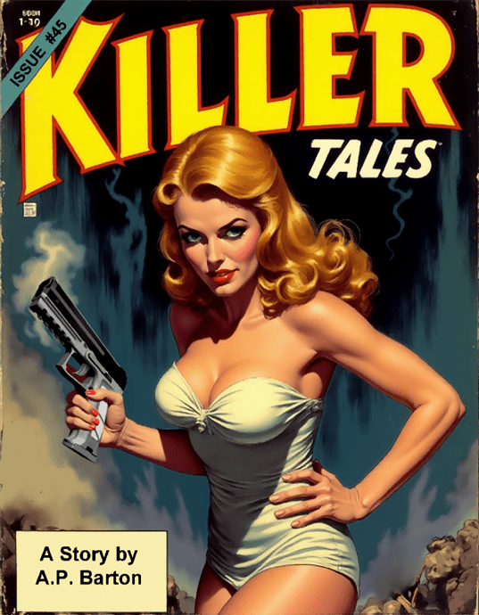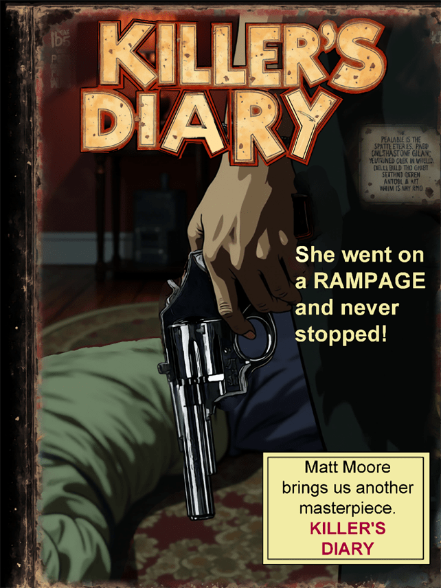
Comic book covers serve as both marketing tools and artistic statements—the first point of contact between a story and its potential reader. For mystery comics in particular, covers play an even more crucial role: they must entice without revealing too much, promise intrigue without spoiling solutions. The evolution of these visual gateways reflects not only changing artistic trends but also shifting cultural attitudes, publishing pressures, and regulatory environments.
The Lurid Appeal of Pre-Code Covers
Before the establishment of the Comics Code Authority in 1954, comic book covers—especially those featuring mysteries and crime stories—embraced a provocative sensibility that today’s readers might find shocking. Publishers like EC Comics with titles such as “Crime SuspenStories” and “Tales from the Crypt” featured covers with vivid depictions of violence, horror, and suspense.
These pre-Code covers functioned as miniature billboards, screaming for attention from crowded newsstands. Artists like Johnny Craig and Al Feldstein created images that promised readers shocking reveals inside: bodies discovered in unexpected places, criminals caught in the act, or detectives uncovering gruesome evidence.
The cover of “Crime SuspenStories #22” (1954) by Johnny Craig—featuring a man holding a bloody axe and a woman’s severed head—became infamous during the Senate hearings on juvenile delinquency that led to the Comics Code. This single image encapsulates the era’s approach: graphic, direct, and designed to provoke an immediate emotional response.
The Comics Code Era: Restraint and Suggestion

After the implementation of the Comics Code, cover artists faced strict limitations on their content. Violence could no longer be depicted explicitly, and words like “horror” and “terror” were banned from titles. Mystery and crime comics had to pivot dramatically, finding new ways to suggest intrigue without graphic imagery.
This period saw a rise in covers featuring reaction shots—characters expressing shock or surprise at something outside the frame, leaving readers to wonder what caused such alarm. Artists became masters of implication, using shadow, composition, and facial expressions to suggest danger without showing it directly.
Dell Comics’ “Four Color” mystery issues and Gold Key’s “Boris Karloff Tales of Mystery” exemplify this approach. Their covers typically featured characters in moments of realization or fear, often with a light source dramatically illuminating part of the scene while leaving the true threat in shadow.
The Bronze Age: Return of the Atmospheric
As the Comics Code gradually relaxed in the late 1960s and 1970s, mystery comic covers began to incorporate more atmospheric elements. Artists like Bernie Wrightson, Michael Kaluta, and Neal Adams brought sophisticated illustration techniques to covers for titles like “House of Mystery” and “House of Secrets.”
These covers relied less on shock value and more on creating a sense of unease or supernatural dread. Architectural elements loomed large—Gothic mansions, twisted trees, and ominous doorways suggested entry points to worlds where normal rules didn’t apply. The mystery was no longer just about “whodunit” but about the nature of reality itself.
DC’s mystery anthology “The Unexpected” featured particularly effective covers during this period, often using surreal imagery and perspective distortion to disorient viewers—a visual parallel to the twists readers would find inside.
The Modern Era: Design Consciousness
Today’s mystery comic covers reflect a more design-conscious approach. Artists have absorbed influences from graphic design, film posters, and digital art to create covers that function as sophisticated puzzles themselves.
Series like Ed Brubaker and Sean Phillips’ “Criminal” feature covers that use minimalist compositions, strategic color palettes, and symbolic imagery to suggest the themes of each issue rather than depicting specific scenes. The mystery begins with the cover itself—what does this image mean, and how will it relate to the story inside?
Similarly, David Mack’s painted covers for “Kabuki” and “Cover” employ mixed media and layered imagery to create visual mysteries that complement the narrative content. These covers reward close examination, with details that take on new meaning after reading the stories they introduce.
The Impact of Digital Platforms
The rise of digital comics has fundamentally changed how covers function. No longer competing for attention on physical newsstands, covers now appear as thumbnails in digital storefronts or social media feeds. This has led to simpler, more iconic designs that remain legible and impactful at small sizes.
Mystery comics have adapted to this reality with high-contrast images, bold typography, and compositions that communicate genre at a glance. Series like “The Department of Truth” by James Tynion IV and Martin Simmonds use distinctive visual styles and consistent design elements to build brand recognition while maintaining the sense of mystery essential to the genre.
Variant Covers: Multiple Facets of Mystery
The phenomenon of variant covers, which became industry standard in the 1990s and expanded dramatically in recent years, offers mystery comics a unique opportunity: the chance to present multiple perspectives on the same story. A single issue might have covers that emphasize different characters, highlight various clues, or focus on different aspects of the central mystery.
“Gideon Falls” by Jeff Lemire and Andrea Sorrentino used variant covers particularly effectively, with Sorrentino’s main covers focusing on surreal, fragmented imagery while variants by guest artists offered alternative interpretations of the series’ central mysteries.
Cultural Reflection and Subversion
Throughout their evolution, mystery comic covers have reflected broader cultural attitudes toward crime, justice, and the unknown. Early covers often reinforced simplistic moral views—criminals were visibly sinister, detectives heroic and decisive. Modern covers tend to embrace ambiguity and moral complexity.
Covers for series like “Alias” (featuring Jessica Jones) by David Mack and “Powers” by Michael Avon Oeming deliberately subvert traditional mystery imagery, acknowledging that in contemporary stories, the line between detective and criminal, or between mystery and revelation, is rarely clear-cut.
Typography as Part of the Mystery
The evolution of lettering and typography on mystery comic covers deserves special attention. From the bold, hand-drawn exclamations of pre-Code covers (“MURDER!” “SHOCKING CRIME!”) to the more subtle integration of text and image in contemporary designs, the way words appear on covers has changed dramatically.
Modern mystery comics often use typography as an integral part of the cover design. Series like “Department of Truth” and “Something Is Killing the Children” employ distinctive title treatments that become inseparable from the series’ identity. The lettering itself becomes part of the mystery—fragmented, distorted, or partially obscured to suggest the elusive nature of truth within the stories.
Homage and Innovation
Today’s mystery comic covers often exist in conversation with the past, with artists deliberately referencing historical styles while adding contemporary twists. Covers for books like “Friday” by Ed Brubaker and Marcos Martin pay homage to classic teen detective book covers while subverting their conventions.
This dialogue between past and present creates another layer of engagement for knowledgeable readers, who can appreciate both the reference and the innovation—a meta-mystery where spotting influences becomes part of the reading experience.
Conclusion: The Evolving Face of Mystery
From screaming headlines and lurid crime scenes to subtle symbolism and design-forward abstraction, the evolution of mystery comic covers demonstrates the remarkable adaptability of the form. Each era found ways to intrigue readers appropriate to its cultural context and technological constraints.
What remains consistent across this evolution is the fundamental purpose: to pose a question that can only be answered by looking inside. The best mystery comic covers, regardless of era, make a promise to readers—that behind this enticing, enigmatic image lies a satisfaction that can only come from solving the puzzle yourself.
As physical and digital publishing continue to evolve, and as artistic trends come and go, the most effective mystery covers will maintain this delicate balance: revealing just enough to draw readers in while concealing the crucial details that make the journey worthwhile.

Leave a Reply