Category: Indie Mystery Comics

Indie mystery graphic novels

  • You’ll Never Believe the Truth About Femme Fatales

    You’ll Never Believe the Truth About Femme Fatales

    Femme Fatales: The Dark Archetype Hiding in Plain Sight
    #image_title

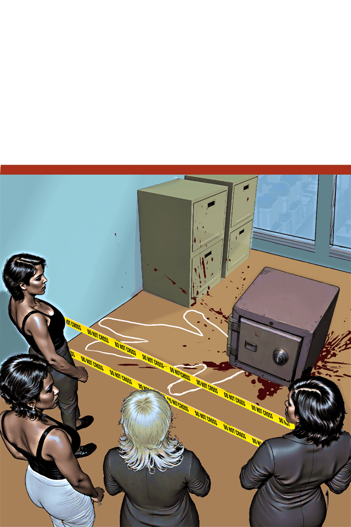
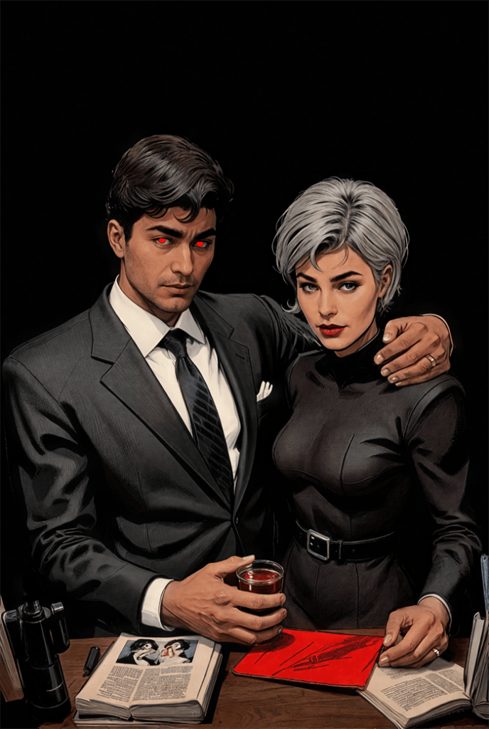
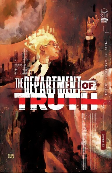
    From the shadowy streets of noir to the complex panels of contemporary graphic novels, femme fatales have been a staple character in mystery storytelling. These dangerous women—seductive, cunning, and often deadly—have evolved significantly since their early appearances in mystery comics.

    What began as one-dimensional stereotypes have developed into nuanced characters whose complexity reflects changing social attitudes and artistic approaches. This evolution tells us as much about shifting cultural perspectives on gender as it does about the development of comic storytelling itself.

    The Classic Era: Post-War Noir Influences (1940s-1950s)

    The femme fatale entered mystery comics primarily through the influence of film noir and hardboiled detective fiction that flourished in post-World War II America. These early comic incarnations borrowed heavily from their cinematic counterparts, both visually and thematically.

    Visual Iconography: The Look of Danger

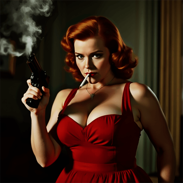
    In series like “Crime SuspenStories” from EC Comics and “Crime Does Not Pay,” femme fatales were instantly recognizable through established visual shorthand:

    • Deep red lipstick and perfectly styled hair
    • Exaggerated hourglass figures and revealing clothing
    • Cigarettes as props suggesting worldliness and moral ambiguity
    • High-contrast lighting that often cast partial shadows across their faces

    This visual language signaled to readers immediately that these women represented both desire and danger. Artists like Johnny Craig and Jack Kamen excelled at creating these iconic images that communicated volumes about character with a single panel.

    Narrative Function: The Destroyer of Men

    In these early mystery comics, the femme fatale served a straightforward narrative function: she was the beautiful trap for an otherwise “good” man. Her primary purpose was to tempt the protagonist (and by extension, the presumed male reader) while advancing a cautionary tale about the dangers of female sexuality.

    Stories typically followed predictable arcs:

    1. A respectable man encounters a beautiful, seductive woman
    2. She persuades him to commit crimes or betray his principles
    3. She ultimately betrays him, leading to his downfall
    4. She either escapes punishment or meets a violent end herself

    This narrative structure reinforced post-war anxieties about changing gender roles as women who had entered the workforce during wartime were being pressured to return to domestic spheres. The femme fatale represented fears about female independence and sexual agency outside male control.

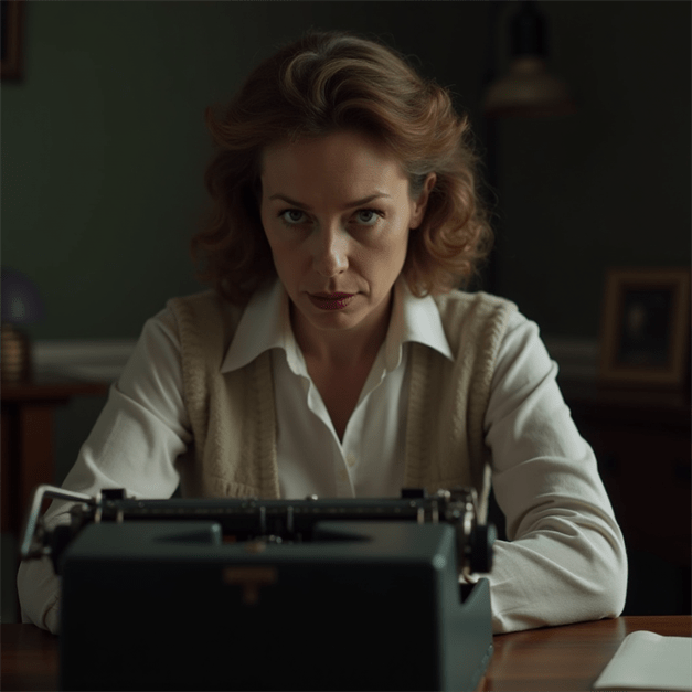
    Censorship and Adaptation

    The implementation of the Comics Code Authority in 1954 severely restricted how femme fatales could be portrayed. Explicit sexuality, violence, and moral ambiguity—hallmarks of the classic femme fatale—were suddenly forbidden in mainstream comics.

    Mystery comics adapted by:

    • Softening femme fatales into “bad girls” who were redeemable
    • Moving seduction to subtext rather than explicit content
    • Ensuring these characters were always punished for their misdeeds
    • Reducing their narrative significance and screen time

    This censorship forced creative adaptation but also temporarily stunted the character archetype’s development in mainstream mystery comics.

    The Transitional Period: Reinvention and Subversion (1960s-1980s)

    #image_title

    As social attitudes shifted and the Comics Code gradually loosened, mystery comics began reexamining and reinventing the femme fatale in more complex ways.

    The Anti-Heroine Emerges

    The strict moral binaries of earlier decades gave way to more ambiguous characterizations. In series like “Deadly Hands of Kung Fu” and “Master of Kung Fu,” characters like Leiko Wu presented as femme fatale figures initially but revealed greater complexity and even heroic qualities as stories progressed.

    These transitional femme fatales:

    • Retained the visual signifiers of the classic femme fatale
    • Initially appeared as threats or antagonists
    • Revealed sympathetic motivations for their actions
    • Often switched allegiances to assist the protagonist
    • Maintained agency and independence regardless of their alignment

    This evolution reflected the influence of second-wave feminism and changing perspectives on female characters in popular media.

    Underground Comix and Breaking Boundaries

    While mainstream comics were still restricted by the Comics Code, underground comix of the 1970s explored the femme fatale without constraints. Artists like Spain Rodriguez in “Trashman” and Howard Chaykin in early work like “The Scorpion” created femme fatales who were sexually explicit, unapologetically violent, and morally complex.

    These underground versions introduced several innovations:

    • Exploring female perspectives and motivations
    • Connecting femme fatale behavior to legitimate grievances against patriarchal systems
    • Using the archetype to critique social norms rather than reinforce them
    • Experimenting with visual representations that challenged the male gaze

    Though these comics had limited distribution, their influence gradually seeped into mainstream work, particularly as creators moved between underground and commercial publishing.

    The Modern Reinvention: Complexity and Depth (1980s-2000s)

    #image_title

    The 1980s marked a turning point for femme fatales in mystery comics, as greater creative freedom and maturing storytelling techniques allowed for more sophisticated character development.

    Deconstructing the Archetype

    Alan Moore’s “Watchmen” (1986-1987) offered a groundbreaking deconstruction of the femme fatale through the character of Silk Spectre (Laurie Juspeczyk). Initially presented with many visual cues of the femme fatale, Laurie’s character systematically undermines the archetype’s tropes:

    • Her sexualized appearance is revealed as marketing imposed upon her by others
    • She rejects manipulation as a power tactic in favor of direct confrontation
    • Her relationships are complex and not primarily defined by seduction
    • Her character arc involves rejecting the legacy of her mother (the original Silk Spectre), who more closely embodied the classic femme fatale

    This deconstruction inspired other creators to examine what lay beneath the surface of the femme fatale archetype.

    Noir Revival with a Twist

    Frank Miller’s “Sin City” (1991-2000) revisited noir traditions but with significant revisions to the femme fatale concept. Characters like Gail and Miho in the Old Town sequence retained deadly and seductive qualities but operated within a community of women who used these traits strategically for collective protection and autonomy.

    Miller maintained many visual elements of the classic femme fatale but subverted expectations by:

    • Giving these characters clear moral codes and loyalty to their communities
    • Portraying their deadly skills as professional rather than merely manipulative
    • Allowing them victories rather than inevitable punishment
    • Creating female networks rather than isolating these characters as singular threats

    While Miller’s work has been criticized for other aspects of its gender politics, his reimagining of the femme fatale as part of a community rather than a lone predator represented a significant evolution.

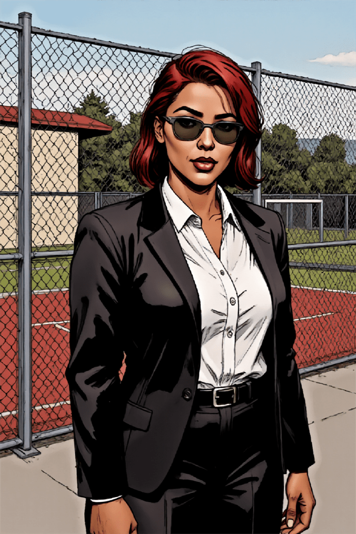
    The Femme Fatale as Protagonist

    Perhaps the most significant development of this era was the shift from femme fatales as antagonists or supporting characters to protagonists in their own right. Greg Rucka and J.G. Jones’ “Whiteout” (1998) featured Carrie Stetko, a U.S. Marshal with a troubled past who incorporates elements of the femme fatale aesthetic while functioning as the detective protagonist.

    Similarly, Ed Brubaker and Sean Phillips in “Criminal” created complex female characters like Greta who initially appear as classic femme fatales but are revealed to have depth, agency, and motivations far beyond their relationships with male characters.

    These protagonist femme fatales:

    • Maintained the dangerous competence of the archetype
    • Used sexuality strategically rather than being defined by it
    • Possessed complete narrative arcs independent of male characters
    • Had morally ambiguous but comprehensible motivations
    • Ended stories in ways other than punishment or redemption

    Contemporary Approaches: Subversion and Diversity (2000s-Present)

    The most recent era of mystery comics has approached the femme fatale with greater awareness of the archetype’s history and problematic aspects, creating deliberate subversions and diverse interpretations.

    Role Reversals and Gender Fluidity

    Modern mystery comics frequently play with gender expectations by creating male characters who embody traditional femme fatale characteristics or by introducing non-binary characters who utilize aspects of the archetype.

    In series like “The Wicked + The Divine” by Kieron Gillen and Jamie McKelvie, characters across the gender spectrum employ seduction, manipulation, and deadly charm—traditional femme fatale traits—expanding the archetype beyond its gendered origins.

    Terry Moore’s “Rachel Rising” features multiple female characters who embody different aspects of the femme fatale but in a narrative that centers female perspectives and relationships, effectively reclaiming the archetype from its origins in the male gaze.

    Cultural Specificity and Diverse Representations

    Contemporary mystery comics have also expanded the femme fatale beyond her traditionally white, Western incarnation. Series like “Fatale” by Brubaker and Phillips incorporate supernatural elements from various cultural traditions, while Brian K. Vaughan and Fiona Staples’ “Saga,” though not primarily a mystery, features femme fatale characters from diverse fantasy races and backgrounds.

    Marjorie Liu and Sana Takeda’s “Monstress” draws on Asian mythology and aesthetic traditions to create femme fatale figures whose dangerous allure stems from cultural contexts beyond the Western noir tradition.

    These culturally diverse femme fatales:

    • Draw on visual traditions beyond Hollywood noir
    • Incorporate mythological and folklore elements from various cultures
    • Explore how beauty standards and seduction operate in different cultural contexts
    • Connect feminine danger to specific historical and social circumstances

    Meta-Commentary and Self-Awareness

    Perhaps the most sophisticated contemporary approach involves femme fatale characters who demonstrate awareness of the archetype they embody. In Chelsea Cain and Kate Niemczyk’s “Mockingbird,” the protagonist Bobbi Morse occasionally performs femme fatale tropes with clear self-awareness, using cultural expectations strategically while maintaining her agency.

    Similarly, in “Lady Killer” by Joëlle Jones and Jamie S. Rich, protagonist Josie Schuller—a 1960s housewife who moonlights as an assassin—consciously employs femme fatale visuals and behaviors as professional tools rather than innate qualities.

    This meta-awareness:

    • Acknowledges the constructed nature of the femme fatale archetype
    • Uses familiarity with the trope for both comedy and commentary
    • Allows characters to move in and out of the role as needed
    • Distinguishes between performance and authentic character

    Visual Evolution: From Object to Subject

    The visual representation of femme fatales in mystery comics provides perhaps the clearest window into their evolution. This transformation can be traced through several key aspects:

    The Gaze Perspective

    Early femme fatales were invariably drawn from a male gaze perspective—presented as objects to be viewed rather than subjects with perspective. Contemporary artists have dramatically shifted this approach:

    • Early era (1940s-1950s): Women posed to maximize sexual appeal regardless of narrative context
    • Transitional era (1960s-1980s): More dynamic posing but still emphasizing physical attributes
    • Modern era (1980s-2000s): Increasing focus on facial expressions and emotional states
    • Contemporary era (2000s-present): Panels frequently drawn from the femme fatale’s perspective, making her the subject rather than object of the gaze

    Body Diversity and Realism

    The physical representation of femme fatales has also evolved significantly:

    • Early era: Exaggerated hourglass figures with impossible proportions
    • Transitional era: Slightly more realistic bodies but still idealized
    • Modern era: Greater variation in body types though still trending toward conventional attractiveness
    • Contemporary era: Genuine diversity in body representation, including age variation, different body types, and physical disabilities

    Costume and Visual Signifiers

    The visual shorthand that identifies a character as a femme fatale has expanded dramatically:

    • Early era: Limited to tight dresses, lingerie, specific hairstyles, and red lips
    • Transitional era: Beginning to incorporate diverse fashion while maintaining high glamour
    • Modern era: Wider range of styles including professional clothing, practical attire, and period-specific fashion
    • Contemporary era: Visual signifiers may be situational rather than constant, allowing characters to move between femme fatale signaling and other visual identities

    Thematic Evolution: From Punishment to Empowerment

    Perhaps the most significant evolution is in the thematic treatment of femme fatales and what they represent in mystery narratives:

    Agency and Motivation

    Early femme fatales were often portrayed as almost instinctively destructive, like forces of nature rather than rational actors:

    • Early era: Motivated by greed, jealousy, or inherent evil
    • Transitional era: Beginning to show realistic motivations like self-preservation
    • Modern era: Complex motivations including principles, protection of others, and response to past trauma
    • Contemporary era: Full psychological complexity with motivations that may be heroic, villainous, or ambiguous depending on perspective

    Narrative Fate

    The typical narrative conclusion for femme fatales has dramatically shifted:

    • Early era: Almost always punished by death or imprisonment
    • Transitional era: Occasionally redeemed through sacrifice or love
    • Modern era: Varied fates including victory, compromise, or consequences proportional to actions
    • Contemporary era: Outcomes based on narrative logic rather than moral judgment about female sexuality

    Relationship to Other Women

    Perhaps the most telling evolution is how femme fatales relate to other female characters:

    • Early era: Usually isolated, often in competition with “good women”
    • Transitional era: Beginning to show camaraderie with other morally ambiguous women
    • Modern era: Capable of genuine friendship and loyalty to other women
    • Contemporary era: Often part of female communities with complex internal relationships

    Femme Fatales: The Dark Archetype Hiding in Plain Sight

    The evolution of the femme fatale in mystery comics reflects broader social changes in how we understand gender, sexuality, and power. What began as a one-dimensional stereotype warning of the dangers of female sexuality has developed into a rich character type capable of carrying complex narratives.

    Today’s mystery comics offer femme fatales who can be heroes or villains, protagonists or antagonists, but who are always fully realized characters rather than merely plot devices for male-centered stories. They retain the dangerous allure that defined the archetype but have gained the depth, agency, and complexity that transforms a stereotype into compelling character.

    This evolution continues as contemporary creators—particularly women, LGBTQ+ individuals, and people of color—reclaim and reinvent the femme fatale from new perspectives. Rather than fading away as gender politics evolve, the femme fatale has proven remarkably adaptable, shedding problematic aspects while retaining the core appeal of a character who weaponizes expectations, embraces ambiguity, and refuses simple categorization.

    In mystery comics, as in the best mystery stories, what appears simple on the surface reveals unexpected complexity when examined closely. The femme fatale’s journey from flat stereotype to rich character demonstrates how powerful archetypes don’t disappear as society evolves—they transform, revealing new facets and possibilities with each generation of storytellers.

  • Could These Mystery Graphic Novels Be the Next Big Thing?

    Could These Mystery Graphic Novels Be the Next Big Thing?

    color theory in mysteries

    In prose mysteries, authors meticulously describe crime scenes to plant clues, establish atmosphere, and ground readers in the reality of the investigation. Mystery graphic novels face a unique challenge—and opportunity—by making these descriptions visual. The illustrator becomes both scene-setter and clue-planter, using visual details to simultaneously engage, mislead, and inform readers. This visual dimension transforms how mysteries unfold and how readers interact with the investigative process.

    The Reader as Active Investigator

    Unlike prose where authors control exactly what information readers receive through description, graphic novels present entire scenes at once. This shifts readers from passive recipients to active investigators who must decide:

    • Which details to focus on
    • What might be significant versus decorative
    • How to interpret visual information without textual guidance

    This relationship mirrors the actual detective process, turning readers into de facto investigators examining the scene alongside the protagonist. Artists like Dave Gibbons (“Watchmen”) and Eduardo Risso (“100 Bullets”) exploit this dynamic by embedding crucial clues within richly detailed panels that reward scrutiny but don’t immediately announce their significance.

    Visual Continuity and Contradiction

    Dangerlove's characters

    Crime scene details in graphic novels serve another crucial function: establishing consistency and continuity. Readers can verify whether elements appear, disappear, or change position across panels—details that may signal:

    • The passage of time
    • Evidence tampering
    • Unreliable narration
    • Character observations

    In Jeff Lemire and Andrea Sorrentino’s “Gideon Falls,” the mysterious Black Barn changes subtly across appearances, with tiny inconsistencies hinting at its impossible nature. Similarly, in “From Hell,” Eddie Campbell’s detailed Victorian London settings maintain meticulous consistency except when deliberately broken to suggest supernatural elements or perceptual shifts.

    The Three Tiers of Detail

    Effective mystery illustrators typically work with three levels of visual information:

    1. Narrative Necessities

    These are the elements required to understand basic story progression—the corpse, the weapon, the detective’s actions. They’re typically prominently featured and clearly rendered.

    2. Contextual Enrichment

    These details establish setting, time period, and atmosphere, creating the world in which the mystery unfolds. They enhance immersion without necessarily providing clues.

    3. Investigative Triggers

    These are the subtle details that matter to the mystery’s solution—a misplaced object, an inconsistent shadow, an unusual angle. They may initially blend with contextual details but become significant later.

    François Schuiten’s architectural precision in “The Theory of the Grain of Sand” exemplifies this tiered approach. His elaborately detailed buildings contain both contextual richness and carefully placed anomalies that become central to the unfolding mystery.

    The Forensic Panel: Technical Precision in Service of Story

    Some graphic mysteries employ what might be called “forensic panels”—highly detailed, often zoomed-in views of crime scene elements that invite readers to examine evidence as a detective would. These panels serve multiple functions:

    • Highlighting potentially important clues
    • Creating rhythm by slowing narrative pace at crucial moments
    • Building tension through visual emphasis

    David Finch’s work on “Batman: The Dark Knight” exemplifies this technique, using extreme detail in evidence-focused panels while employing more expressionistic styles for action or emotional beats. This visual shift signals to readers when to engage their analytical faculties.

    Color as Investigative Tool

    Color in mystery graphic novels isn’t merely aesthetic—it functions as an investigative element. Color can:

    • Code timelines (different color palettes for different time periods)
    • Flag connections (linking seemingly unrelated scenes through color motifs)
    • Signal emotional undercurrents (using psychological color effects)
    • Highlight key evidence (selective color emphasis in otherwise muted scenes)

    Dave Stewart’s coloring in “Blacksad” demonstrates this approach, using distinct color temperatures for different locations and character associations while maintaining noir-inspired shadows that obscure certain details until they become relevant.

    Case Study: “Stumptown” and Environmental Storytelling

    Greg Rucka and Matthew Southworth’s “Stumptown” exemplifies masterful crime scene detail work. Consider how they handle investigative environments:

    1. Location-specific details that ground the story in Portland, Oregon’s authentic geography
    2. Weather effects that influence both the crime and its investigation
    3. Environmental degradation that reflects case progression
    4. Character-revealing interactions with scene elements

    Southworth’s detailed backgrounds aren’t merely decorative—they’re narrative tools containing potential clues, red herrings, and character insights. A discarded lottery ticket in one panel might become crucial evidence three issues later, rewarding attentive readers while maintaining narrative integrity.

    The Burden of Realism vs. Stylization

    graphic novels

    Mystery graphic novelists face a particular tension between realism and stylization. Too realistic, and crucial details might be lost in visual noise; too stylized, and the mystery might seem arbitrary rather than fair-play. Different artists resolve this tension in distinctive ways:

    • Sean Phillips (“Criminal”) uses a gritty realism with selective detail emphasis, focusing readers on key elements through composition and lighting
    • Jock (“Detective Comics”) employs expressionistic shadows and selective detail to highlight emotional and evidentiary focal points
    • Darwyn Cooke (“Parker” series) uses mid-century minimalism that makes any detailed element immediately significant by contrast

    Each approach creates different reader expectations about how visual information relates to the mystery’s solution.

    Digital vs. Traditional Approaches to Detail

    The digital revolution has transformed how crime scene details function in mystery comics:

    Traditional Media Advantages

    • Textural variations can suggest material properties relevant to crimes
    • Media-specific effects (ink spatters, watercolor bleeds) can mimic crime scene elements
    • Physical limitation forces economical detail selection

    Digital Advantages

    • Precision detail can be maintained consistently across panels
    • Zoom functions allow readers to examine minute details
    • Layer effects can subtly highlight or obscure elements

    Chris Samnee’s work in “Black Widow” demonstrates a hybrid approach, using traditional techniques for organic elements while leveraging digital precision for technological details central to espionage-focused mysteries.

    Teaching Readers How to Read the Scene

    Sophisticated mystery graphic novels often “train” readers in how to interpret their visual language. Early chapters may explicitly highlight details that solve minor mysteries, establishing a visual grammar readers can apply to more complex puzzles later. This educational aspect creates a deepening relationship between creator and audience.

    Brian Michael Bendis and Michael Avon Oeming’s “Powers” exemplifies this approach. Early cases feature explicit visual callbacks to previously established clues, training readers to recognize the significance of certain details, angles, and visual motifs that become more subtle as the series progresses.

    Practical Techniques for Mystery Illustrators

    For creators working in the mystery graphic novel space, certain techniques have proven particularly effective:

    1. Consistent object placement that allows readers to track items across scenes
    2. Architectural precision that prevents spatial cheating
    3. Character-specific environmental interaction where different characters notice or interact with different details
    4. Visual callbacks that link current scenes to earlier, seemingly unrelated moments
    5. Progressive revelation where panels revisit locations with new details visible

    These techniques maintain the “fair play” ethos central to mystery fiction while exploiting the unique possibilities of visual storytelling.

    Conclusion

    In the best mystery graphic novels, every shadow, object placement, and background detail potentially matters. The crime scene becomes not merely a backdrop but an active participant in the narrative—a visual puzzle that readers must solve alongside the protagonist.

    This visual dimension transforms the traditional mystery from a game played primarily in the mind to one that engages multiple cognitive systems—pattern recognition, spatial awareness, color perception, and narrative sequencing. The illustrator becomes both the mystery’s architect and its gatekeeper, using visual details to create a labyrinth that’s challenging enough to engage but fair enough to solve.

    For readers, this visual element adds a unique dimension to the mystery experience. When the detective finally explains the solution, the best graphic mysteries allow us to flip back through pages and see what was hiding in plain sight all along—not described but shown, waiting patiently in the background for us to notice what was always there.

  • The Ultimate Guide to Comic Book Covers in 2025 Pt. 1

    The Ultimate Guide to Comic Book Covers in 2025 Pt. 1

    Comic Book Covers


    Comic book covers have come a long way since their lurid, eye-grabbing days in the pre-Code era. Today, they are more sophisticated than ever—offering not just clues to the narrative within, but a deep connection to the themes, characters, and emotions that define modern mystery comics.

    The role of the cover has expanded, from simple marketing tool to a crucial part of the storytelling itself. As the genre continues to evolve, so too does the way covers entice, intrigue, and challenge readers.

    The Digital Revolution: New Frontiers of Comic Book Covers

    The shift to digital comics has made covers even more integral to the reading experience. As digital comics proliferate across platforms, the way covers are designed has had to adapt to new formats and expectations.

    Thumbnails are now the first touchpoint for potential readers, requiring covers to grab attention at a much smaller scale. This has encouraged minimalist designs that are still visually striking, relying on strong contrasts and bold icons that make an instant impression.

    The move to digital has also allowed for more dynamic cover interactions. Animated or motion-sensitive covers are no longer outside the realm of possibility. F

    or example, comics on platforms like Webtoon and Tapas often feature covers that transform or change as readers scroll or tap through them, enhancing the mystery by adding another layer of unpredictability.

    This fluidity encourages readers to look beyond the initial image, offering a more immersive experience that challenges the traditional static approach to cover art.

    The Influence of Cinematic Techniques

    The Ultimate Guide to Comic Book Covers in 2025

    Film, with its established use of visual storytelling, has become an increasingly significant influence on comic book covers. The way mystery comics are marketed has taken cues from cinematic poster design, where a single image must convey both the genre and tone of the film. In much the same way, today’s comic book covers—particularly in the mystery genre—are often designed to evoke the mood and suspense of a film noir or a psychological thriller.

    Modern mystery comics like Criminal and The Department of Truth often use high-contrast compositions, shadows, and silhouettes that would not look out of place on the poster of a neo-noir film.

    Additionally, just like film posters, the covers for these comics sometimes feature close-up portraits of key characters, placing emphasis on their emotional state or their role in the story’s central mystery.

    This cinematic approach invites readers to immediately connect with the character, further drawing them into the world within.

    Breaking the Fourth Wall: The Meta Mystery

    book covers

    Some of the most compelling covers of modern mystery comics embrace a meta-narrative, breaking the fourth wall and creating a conversation between the cover and the reader.

    The cover itself becomes part of the story’s puzzle, inviting the reader to reconsider everything they know about the narrative, sometimes even before they open the book.

    A prime example of this approach is The Vision by Tom King, whose covers often featured stark, minimalistic designs that challenged readers to reconsider the superhero genre.

    The covers weren’t just a prelude to the mystery inside but were themselves a riddle that needed to be solved. The symmetry and color choices reflected themes of identity, family, and perception, creating a seamless transition between the cover and the pages that followed. Readers had to ask: What’s real? What’s artificial? What does it mean for something to be “normal”?

    Similarly, the use of meta-cover art in Wytches by Scott Snyder and Jock took this idea further. The cover images were meant to be unsettling in themselves, with distorted faces and eerie figures that reinforced the book’s themes of fear, folklore, and monstrous transformations. The cover art didn’t just hint at the mystery—it was the mystery, drawing attention to the unnerving atmosphere of the comic before the first page was even turned.

    The Role of Color: Hues of Suspense

    Dangerlove's

    Color has always played an important role in comic book covers, but in mystery comics, it has become a key storytelling tool in its own right. Whether it’s the use of a muted, monochromatic palette to signal a somber, introspective mystery, or the fiery oranges and reds to indicate urgency or danger, color schemes convey as much information about the genre as the image itself.

    Take, for example, the muted blues and grays of The Department of Truth. The cold palette signals the book’s cerebral approach to its conspiracy-driven mystery, while the splashes of red or yellow that appear in key moments add to the urgency and dissonance of the story. The color isn’t just decoration—it actively informs the reader of the tone and themes of the book before they even engage with the narrative.

    In contrast, Something Is Killing the Children uses bold, contrasting colors to draw attention to the most disturbing elements of the story. The dark, brooding tones contrast sharply with bright pops of red—symbolizing bloodshed and the horror at the heart of the story. The color work here plays an essential role in building the tension and sense of dread that defines the series.

    Reaching Beyond the Page: Comic Book Covers as Fine Art

    In an era where comic book art is increasingly appreciated as fine art, many modern mystery comics have embraced the opportunity to push the boundaries of cover design. Artists like Alex Ross, Dave McKean, and Frank Miller have contributed covers that not only serve as visual preludes to the mysteries inside but as standalone pieces of art in their own right.

    For example, McKean’s covers for The Sandman are often intricate, surreal, and symbolic, offering a glimpse into the dreamlike world of Neil Gaiman’s series. These covers don’t just tease the story—they embody the very themes of the book: dreams, nightmares, and the unknowable forces that shape our perceptions of reality. Each cover is a puzzle, just like the stories contained within, making the process of decoding them as enjoyable as reading the issues themselves.

    Similarly, the use of minimalist design in books like Criminal—where a simple image can speak volumes about the themes of crime, guilt, and retribution—demonstrates the power of simplicity. These covers reduce the mystery to its most elemental form, creating a dialogue between image and narrative that invites readers to explore the deeper layers of meaning within the pages.

    The Ongoing Evolution

    The history of mystery comic book covers is not just about trends in illustration, but about how artists have continually found new ways to draw readers into the world of mystery and intrigue. From the lurid and shocking pre-Code images to the sophisticated, design-driven covers of today, each era has left its mark on the genre. What remains constant, however, is the fundamental purpose of the cover: to present a mystery, to tantalize and tease, and to ensure that the reader’s curiosity will lead them to turn the page.

    As digital comics grow in prominence and new storytelling formats emerge, it will be exciting to see how mystery comic book covers continue to evolve. Will covers become even more interactive, with hidden clues that change based on reader choices?

    Or will the enduring appeal of a single, powerful image continue to captivate? One thing is for sure—whether it’s through vibrant color, innovative design, or playful subversion of tradition, the art of the reveal will remain at the heart of comic book storytelling.

    End of Part 1.

  • Unlock the Secret Addictive Power of Mystery Comics

    Unlock the Secret Addictive Power of Mystery Comics

    mystery writing

    In the world of mystery comics, color isn’t just decorative—it’s narrative. While the written word relies on descriptive language to set a scene’s mood, comics have the unique advantage of using color palettes to instantly communicate atmosphere, emotion, and even subtle clues.

    The strategic use of color can transform a simple detective story into an immersive psychological experience, guiding readers through the fog of mystery toward (or sometimes away from) the truth.

    The Psychology of Color in Mystery

    Before examining specific works, it’s worth understanding how different color schemes affect readers on a psychological level:

    • Monochromatic schemes (variations of a single color) create cohesion and often suggest a singular, focused perspective
    • Complementary colors (opposite on the color wheel) create visual tension that mirrors narrative conflict
    • Analogous palettes (colors adjacent on the wheel) build harmony that can be strategically disrupted to signal danger
    • Desaturated colors suggest the past, memory, or unreliability
    • High contrast heightens drama and emphasizes divisions between characters or concepts

    Mystery comics leverage these principles not just for aesthetic appeal but as sophisticated storytelling tools.

    Noir Traditions and Their Evolution

    Classic noir-inspired mystery comics traditionally embraced high-contrast black and white or limited color palettes. Works like Frank Miller’s “Sin City” strip color away almost entirely, using stark blacks and whites with occasional splashes of color (a woman’s red dress, yellow skin) to highlight elements crucial to the narrative.

    Modern mystery comics have evolved this approach. Consider how Sean Phillips’ coloring in “Criminal” and “The Fade Out” uses muted, desaturated tones punctuated by vibrant accents. This technique creates a world that feels simultaneously grounded in reality yet slightly removed—perfect for stories where truth is elusive.

    Case Study: “Blacksad” by Juanjo Guarnido

    Blacksad
    #image_title

    Perhaps no mystery comic demonstrates color mastery better than “Blacksad.” Guarnido’s watercolor technique allows for:

    1. Environmental storytelling – Rainy scenes use cool blues and grays to convey melancholy, while corrupt settings often feature sickly yellows and browns
    2. Character coding – Protagonist John Blacksad’s black fur contrasts with white facial markings, visually representing his moral ambiguity
    3. Temporal shifts – Flashbacks use warmer, sepia-toned palettes to distinguish them from the cooler-toned present
    4. Emotional progression – As mysteries unravel, color schemes gradually shift, sometimes brightening as truth emerges or darkening as dangers increase

    The anthropomorphic characters also allow for color symbolism through species selection—red foxes for seductive characters, reptiles in cold greens for calculating villains.

    Using Color to Hide and Reveal

    In “Daytripper” by Fábio Moon and Gabriel Bá, color palette shifts signal alternate realities and outcomes in what becomes an existential mystery. The reader learns to track these subtle changes as clues to which timeline they’re witnessing.

    Jeff Lemire and Andrea Sorrentino’s “Gideon Falls” employs dramatic color contrasts—particularly bold reds against desaturated backgrounds—to highlight elements connected to its central mystery. The color red becomes a visual trigger warning readers of the supernatural threat’s presence even before characters recognize it.

    The Unreliable Palette

    #image_title

    Just as mystery novels may feature unreliable narrators, mystery comics can use “unreliable palettes” that reflect characters’ perceptions rather than objective reality:

    • In “The Department of Truth,” Martin Simmonds uses unstable, painterly color that warps and shifts, visually representing how conspiracy theories distort reality
    • “Mister Miracle” by Tom King and Mitch Gerads employs color glitches and inconsistencies that subtly suggest something is wrong with the protagonist’s perception
    • David Mack’s “Cover” uses different artistic styles and associated color approaches to represent the dual worlds of espionage and comics creation

    Suspense Through Color Progression

    Mystery comics often employ color progressions that build suspense:

    1. The narrowing palette – Colors gradually reduce to a minimal scheme as focus intensifies
    2. The contamination technique – A color associated with danger or a villain slowly “infects” previously safe environments
    3. The reveal enhancement – Major revelations accompanied by dramatic palette shifts

    Matt Fraction and Chip Zdarsky’s “Sex Criminals” uses glowing rainbow colors to represent “the Quiet,” a time-stopping phenomenon. This color scheme becomes a suspenseful signal throughout the series—when these colors begin to appear, readers know a significant shift is imminent.

    Digital Innovation

    Digital coloring has expanded the mystery colorist’s toolkit:

    • Gradient mapping allows for subtle mood transitions impossible in traditional coloring
    • Texture overlays can suggest film grain for noir homages or paper texture for period mysteries
    • Lighting effects create spotlight effects that focus reader attention on key elements

    Jordie Bellaire’s coloring in “The Vision” by Tom King demonstrates how digital techniques can create an unsettling suburban palette that feels simultaneously bright and hollow—perfect for a mystery about artificial beings attempting to mimic human life.

    Cultural Color Considerations

    Mystery comics increasingly acknowledge that color symbolism varies across cultures:

    • White, associated with purity in Western contexts, signifies death in many Eastern cultures
    • Red might represent danger in one context but good fortune in another
    • The emotional weight of specific colors shifts across cultural boundaries

    Global mystery series like “Monster” by Naoki Urasawa consider these differences, using color in ways that respect the settings of their international narratives.

    Practical Applications for Creators

    For comic creators working in the mystery genre, color provides powerful tools:

    1. Establish a baseline palette that represents “normal” before introducing disruptive elements
    2. Create color motifs linked to specific characters, allowing for subtle implication through color alone
    3. Use color timing to pace revelations—a sudden palette shift signals importance
    4. Employ strategic desaturation to suggest unreliability or past events
    5. Control reader focus through selective color emphasis

    The Upshot

    In mystery comics, color isn’t merely decorative but functionally narrative. The most compelling graphic mysteries use color strategically, creating visual atmospheres that guide readers through complex emotional terrain while simultaneously embedding clues and misdirections.

    As printing technology and digital coloring continue to evolve, so too will the sophisticated ways mystery comics leverage color to conceal and reveal, building suspense one carefully chosen hue at a time.

    The next time you pick up a mystery comic, pay attention not just to what the characters say or do, but to the colors that surround them—they’re telling a story all their own.