Category: Mystery Graphic Novel Reviews

Reviews of the best mystery comics

  • Discover Cozy Mystery Comics That Make You Think

    Discover Cozy Mystery Comics That Make You Think

    Cozy Mysteries

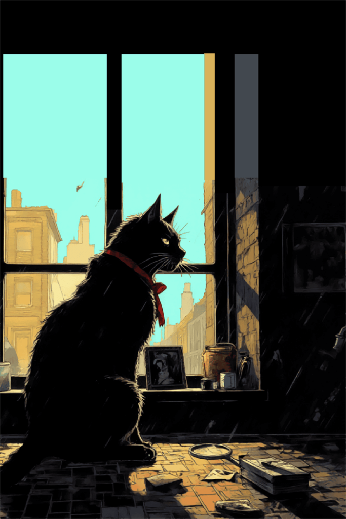
    There’s something undeniably comforting about cozy mystery comics. A quirky detective in a charming setting, a murder that’s somehow both shocking and gentle (if murder can ever be gentle), and the reassuring knowledge that by the final page, order will be restored to the world. Now imagine these beloved elements rendered in vibrant panels and expressive illustrations – the result is a uniquely satisfying hybrid that’s capturing readers’ hearts across both mystery and comic book fandoms.

    The Cozy Formula Meets Visual Storytelling

    The traditional cozy mystery comes with a well-established recipe: a small community, an amateur sleuth with a distinctive profession or hobby, minimal violence (the murder typically happens “off-screen”), and a focus on the puzzle rather than the gore. These elements translate beautifully to the graphic novel format, where illustrators can bring charming settings to life and capture the distinctive personalities that populate the cozy mystery landscape.

    Take Joann Sfar and Emmanuel Guibert’s “The Professor’s Daughter,” which combines Victorian England, mummies, and murder into a delightfully illustrated package. The whimsical art style perfectly complements the gentle humor and low-stakes sleuthing that define the cozy mystery genre, showing how visual elements can enhance rather than distract from the core appeal of these stories.

    Character Design as Storytelling

    Mystery story

    In prose, cozy mystery authors spend considerable time establishing their protagonist’s quirks and specialties – the herbalist with a knack for poison identification, the librarian with an encyclopedic memory, the cat-loving baker who finds clues in the oddest places. In graphic novels, these character traits can be instantly communicated through visual design.

    “Goldie Vance” by Hope Larson and Brittney Williams exemplifies this beautifully. The titular teen detective’s personality shines through her body language, fashion choices, and facial expressions before she even speaks a word. The mid-century Florida resort setting is established in just a few panels, allowing the mystery to unfold more quickly while still building the rich world that cozy mystery fans adore.

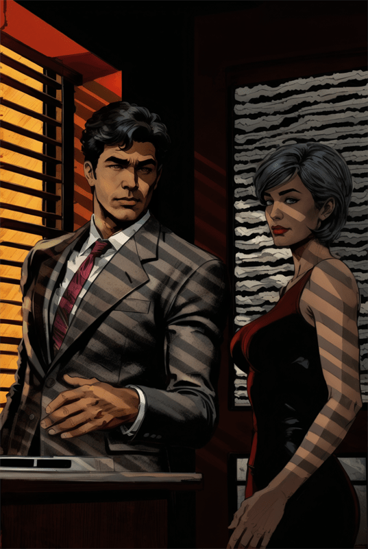
    The Art of the Red Herring

    A good cozy mystery is filled with misdirection – suspicious characters, misleading clues, and perfectly timed reveals. Graphic storytelling offers unique tools for this essential element of mystery crafting. Artists can subtly include visual clues in backgrounds or use panel composition to either highlight or downplay important details.

    In “Miss Don’t Touch Me” by Hubert and Kerascoet, the art deco styling and delicate linework create a deceptively genteel atmosphere that contrasts with the brothel setting, mirroring how appearances can be deceiving in a good mystery. The expressive character art allows readers to form immediate judgments about various suspects – judgments that clever creators can later subvert to satisfying effect.

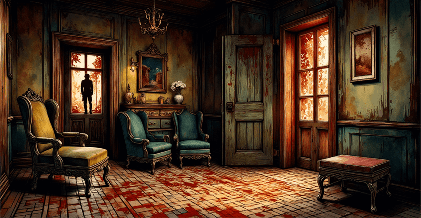
    Small Town Aesthetics in Panels

    small town mystery

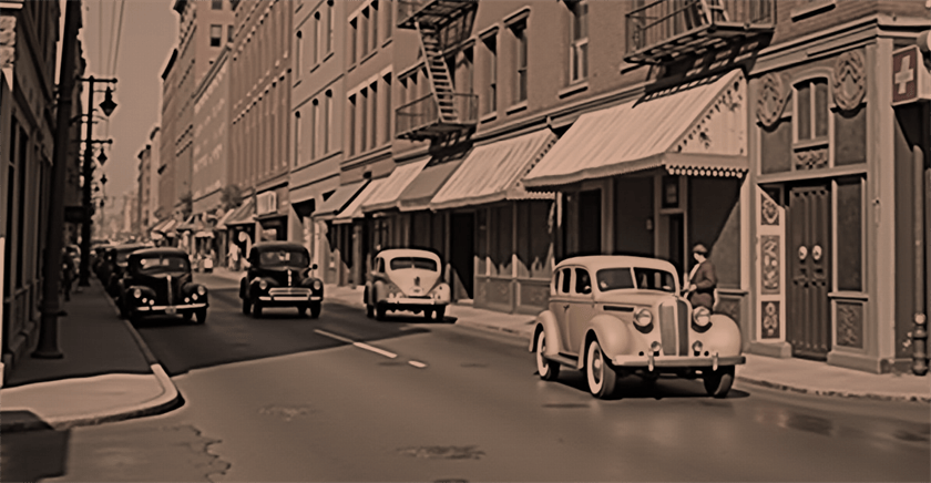
    The cozy mystery’s beloved small-town setting – from English villages to seaside hamlets – becomes a character in its own right when rendered visually. Comic artists can create recurring visual motifs that make these communities feel lived-in and authentic, enhancing the reader’s investment in solving crimes that disrupt these picturesque places.

    Kaori Mori’s “Emma” series, while primarily a historical romance, incorporates mystery elements in a richly detailed Victorian London that demonstrates how meticulous visual worldbuilding enhances story immersion. Similarly, Bryan Lee O’Malley’s “Seconds” uses its restaurant setting as both backdrop and character, showing how integral setting is to the cozy mystery formula, especially when that setting can be visually explored.

    The Culinary Cozy Goes Visual

    cozy mystery comics

    One of the most popular cozy mystery subgenres – the culinary mystery – finds particular success in graphic format. Food illustration has a long tradition in comics and manga, and the opportunity to render mouthwatering desserts and comfort foods alongside amateur sleuthing creates an especially satisfying reading experience.

    “Delicious in Dungeon” by Ryoko Kui, while falling more into fantasy adventure, incorporates mystery elements and showcases how food illustration can become central to storytelling. The detailed cooking sequences provide natural pauses in the investigation, mimicking the rhythm of culinary cozies where recipes and crime-solving are equally important to the reading experience.

    A Growing Market at the Intersection

    The rise of cozy mystery comics reflects broader publishing trends. As graphic novels have gained legitimacy in literary circles and cozy mysteries have maintained their dedicated readership through changing market conditions, the overlap creates a natural growth opportunity. Publishers are increasingly willing to take chances on genre hybrids that might appeal to multiple audience segments.

    Recent successes like “Lumberjanes” by Noelle Stevenson, Grace Ellis, and Brooke Allen demonstrate the commercial viability of gentle mysteries with distinctive visual styles. While not strictly a mystery series, “Lumberjanes” incorporates many cozy elements – a closed community, supernatural puzzles, and character-driven investigation – with a modern art style that attracts younger readers to mystery conventions they might later seek out in traditional prose cozies.

    The Manga Influence

    Japan’s long tradition of mystery manga has significantly influenced Western cozy mystery comics. Series like “Detective Conan” (known as “Case Closed” in North America) pioneered many techniques for visualizing deduction and clue-gathering that Western creators have adapted for their own mystery comics.

    The influence appears in works like Sonny Liew’s “The Art of Charlie Chan Hock Chye,” which, while not strictly a cozy mystery, uses manga-inspired visual techniques to unravel its narrative puzzles. This cross-cultural exchange has enriched the visual language available to creators working in the cozy mystery comic space.

    The Psychology of Mystery Cozy Comics

    The enduring appeal of cozy mysteries lies in their combination of intrigue and comfort – they provide intellectual stimulation without excessive tension or fear. Graphic novels enhance this balance by using art to mediate the more disturbing elements. A stylized illustration of a crime scene feels less threatening than a detailed written description, allowing readers to engage with the puzzle aspect without discomfort.

    Additionally, the visual nature of comics creates natural pacing that mirrors the episodic structure of many cozy mystery series. Each panel turn offers a mini-revelation, and page turns can deliver perfectly timed surprises – structural elements that prose must work harder to achieve.

    The Future of Illustrated Whodunits

    As both the graphic novel market and the cozy mystery genre continue to evolve, we can expect to see more experimentation at their intersection. Digital platforms offer new possibilities for interactive cozy mystery comics, where readers might click on panels to reveal clues or explore locations more thoroughly than traditional print allows.

    Moreover, the visual accessibility of graphic novels opens cozy mysteries to younger readers and those who might find traditional prose challenging, expanding the audience for these comfort-driven puzzles. Series like “The InvestiGators” by John Patrick Green introduce elementary-grade readers to mystery conventions through appealing animal detectives and visual humor.

    Conclusion: A Perfect Pairing

    The marriage of cozy mysteries and comic art creates something greater than the sum of its parts. The visual medium enhances what cozy mystery readers already love – distinctive characters, charming settings, and clever puzzles – while bringing these elements to life in ways that prose alone cannot achieve.

    For creators and publishers looking to stand out in either market, this intersection offers fertile ground for innovation. And for readers who have previously enjoyed only one of these formats, the combination provides a perfect entry point to discover new stories that comfort and intrigue in equal measure.

    In a world that often feels unpredictable and chaotic, both cozy mysteries and comics offer a sense of order and resolution. Together, they create a reading experience that soothes and stimulates – truly a match made in whodunit heaven.

  • The Ultimate Guide to Comic Book Covers in 2025 Pt. 2

    The Ultimate Guide to Comic Book Covers in 2025 Pt. 2

    Pulp covers
    #image_title

    Comic book covers serve as both marketing tools and artistic statements—the first point of contact between a story and its potential reader. For mystery comics in particular, covers play an even more crucial role: they must entice without revealing too much, promise intrigue without spoiling solutions. The evolution of these visual gateways reflects not only changing artistic trends but also shifting cultural attitudes, publishing pressures, and regulatory environments.

    The Lurid Appeal of Pre-Code Covers

    Before the establishment of the Comics Code Authority in 1954, comic book covers—especially those featuring mysteries and crime stories—embraced a provocative sensibility that today’s readers might find shocking. Publishers like EC Comics with titles such as “Crime SuspenStories” and “Tales from the Crypt” featured covers with vivid depictions of violence, horror, and suspense.

    These pre-Code covers functioned as miniature billboards, screaming for attention from crowded newsstands. Artists like Johnny Craig and Al Feldstein created images that promised readers shocking reveals inside: bodies discovered in unexpected places, criminals caught in the act, or detectives uncovering gruesome evidence.

    The cover of “Crime SuspenStories #22” (1954) by Johnny Craig—featuring a man holding a bloody axe and a woman’s severed head—became infamous during the Senate hearings on juvenile delinquency that led to the Comics Code. This single image encapsulates the era’s approach: graphic, direct, and designed to provoke an immediate emotional response.

    The Comics Code Era: Restraint and Suggestion

    #image_title

    After the implementation of the Comics Code, cover artists faced strict limitations on their content. Violence could no longer be depicted explicitly, and words like “horror” and “terror” were banned from titles. Mystery and crime comics had to pivot dramatically, finding new ways to suggest intrigue without graphic imagery.

    This period saw a rise in covers featuring reaction shots—characters expressing shock or surprise at something outside the frame, leaving readers to wonder what caused such alarm. Artists became masters of implication, using shadow, composition, and facial expressions to suggest danger without showing it directly.

    Dell Comics’ “Four Color” mystery issues and Gold Key’s “Boris Karloff Tales of Mystery” exemplify this approach. Their covers typically featured characters in moments of realization or fear, often with a light source dramatically illuminating part of the scene while leaving the true threat in shadow.

    The Bronze Age: Return of the Atmospheric

    As the Comics Code gradually relaxed in the late 1960s and 1970s, mystery comic covers began to incorporate more atmospheric elements. Artists like Bernie Wrightson, Michael Kaluta, and Neal Adams brought sophisticated illustration techniques to covers for titles like “House of Mystery” and “House of Secrets.”

    These covers relied less on shock value and more on creating a sense of unease or supernatural dread. Architectural elements loomed large—Gothic mansions, twisted trees, and ominous doorways suggested entry points to worlds where normal rules didn’t apply. The mystery was no longer just about “whodunit” but about the nature of reality itself.

    DC’s mystery anthology “The Unexpected” featured particularly effective covers during this period, often using surreal imagery and perspective distortion to disorient viewers—a visual parallel to the twists readers would find inside.

    The Modern Era: Design Consciousness

    Today’s mystery comic covers reflect a more design-conscious approach. Artists have absorbed influences from graphic design, film posters, and digital art to create covers that function as sophisticated puzzles themselves.

    Series like Ed Brubaker and Sean Phillips’ “Criminal” feature covers that use minimalist compositions, strategic color palettes, and symbolic imagery to suggest the themes of each issue rather than depicting specific scenes. The mystery begins with the cover itself—what does this image mean, and how will it relate to the story inside?

    Similarly, David Mack’s painted covers for “Kabuki” and “Cover” employ mixed media and layered imagery to create visual mysteries that complement the narrative content. These covers reward close examination, with details that take on new meaning after reading the stories they introduce.

    The Impact of Digital Platforms

    The rise of digital comics has fundamentally changed how covers function. No longer competing for attention on physical newsstands, covers now appear as thumbnails in digital storefronts or social media feeds. This has led to simpler, more iconic designs that remain legible and impactful at small sizes.

    Mystery comics have adapted to this reality with high-contrast images, bold typography, and compositions that communicate genre at a glance. Series like “The Department of Truth” by James Tynion IV and Martin Simmonds use distinctive visual styles and consistent design elements to build brand recognition while maintaining the sense of mystery essential to the genre.

    Variant Covers: Multiple Facets of Mystery

    The phenomenon of variant covers, which became industry standard in the 1990s and expanded dramatically in recent years, offers mystery comics a unique opportunity: the chance to present multiple perspectives on the same story. A single issue might have covers that emphasize different characters, highlight various clues, or focus on different aspects of the central mystery.

    “Gideon Falls” by Jeff Lemire and Andrea Sorrentino used variant covers particularly effectively, with Sorrentino’s main covers focusing on surreal, fragmented imagery while variants by guest artists offered alternative interpretations of the series’ central mysteries.

    Cultural Reflection and Subversion

    Throughout their evolution, mystery comic covers have reflected broader cultural attitudes toward crime, justice, and the unknown. Early covers often reinforced simplistic moral views—criminals were visibly sinister, detectives heroic and decisive. Modern covers tend to embrace ambiguity and moral complexity.

    Covers for series like “Alias” (featuring Jessica Jones) by David Mack and “Powers” by Michael Avon Oeming deliberately subvert traditional mystery imagery, acknowledging that in contemporary stories, the line between detective and criminal, or between mystery and revelation, is rarely clear-cut.

    Typography as Part of the Mystery

    The evolution of lettering and typography on mystery comic covers deserves special attention. From the bold, hand-drawn exclamations of pre-Code covers (“MURDER!” “SHOCKING CRIME!”) to the more subtle integration of text and image in contemporary designs, the way words appear on covers has changed dramatically.

    Modern mystery comics often use typography as an integral part of the cover design. Series like “Department of Truth” and “Something Is Killing the Children” employ distinctive title treatments that become inseparable from the series’ identity. The lettering itself becomes part of the mystery—fragmented, distorted, or partially obscured to suggest the elusive nature of truth within the stories.

    Homage and Innovation

    Today’s mystery comic covers often exist in conversation with the past, with artists deliberately referencing historical styles while adding contemporary twists. Covers for books like “Friday” by Ed Brubaker and Marcos Martin pay homage to classic teen detective book covers while subverting their conventions.

    This dialogue between past and present creates another layer of engagement for knowledgeable readers, who can appreciate both the reference and the innovation—a meta-mystery where spotting influences becomes part of the reading experience.

    Conclusion: The Evolving Face of Mystery

    From screaming headlines and lurid crime scenes to subtle symbolism and design-forward abstraction, the evolution of mystery comic covers demonstrates the remarkable adaptability of the form. Each era found ways to intrigue readers appropriate to its cultural context and technological constraints.

    What remains consistent across this evolution is the fundamental purpose: to pose a question that can only be answered by looking inside. The best mystery comic covers, regardless of era, make a promise to readers—that behind this enticing, enigmatic image lies a satisfaction that can only come from solving the puzzle yourself.

    As physical and digital publishing continue to evolve, and as artistic trends come and go, the most effective mystery covers will maintain this delicate balance: revealing just enough to draw readers in while concealing the crucial details that make the journey worthwhile.

  • Unlock the Secret Addictive Power of Mystery Comics

    Unlock the Secret Addictive Power of Mystery Comics

    mystery writing

    In the world of mystery comics, color isn’t just decorative—it’s narrative. While the written word relies on descriptive language to set a scene’s mood, comics have the unique advantage of using color palettes to instantly communicate atmosphere, emotion, and even subtle clues.

    The strategic use of color can transform a simple detective story into an immersive psychological experience, guiding readers through the fog of mystery toward (or sometimes away from) the truth.

    The Psychology of Color in Mystery

    Before examining specific works, it’s worth understanding how different color schemes affect readers on a psychological level:

    • Monochromatic schemes (variations of a single color) create cohesion and often suggest a singular, focused perspective
    • Complementary colors (opposite on the color wheel) create visual tension that mirrors narrative conflict
    • Analogous palettes (colors adjacent on the wheel) build harmony that can be strategically disrupted to signal danger
    • Desaturated colors suggest the past, memory, or unreliability
    • High contrast heightens drama and emphasizes divisions between characters or concepts

    Mystery comics leverage these principles not just for aesthetic appeal but as sophisticated storytelling tools.

    Noir Traditions and Their Evolution

    Classic noir-inspired mystery comics traditionally embraced high-contrast black and white or limited color palettes. Works like Frank Miller’s “Sin City” strip color away almost entirely, using stark blacks and whites with occasional splashes of color (a woman’s red dress, yellow skin) to highlight elements crucial to the narrative.

    Modern mystery comics have evolved this approach. Consider how Sean Phillips’ coloring in “Criminal” and “The Fade Out” uses muted, desaturated tones punctuated by vibrant accents. This technique creates a world that feels simultaneously grounded in reality yet slightly removed—perfect for stories where truth is elusive.

    Case Study: “Blacksad” by Juanjo Guarnido

    Blacksad
    #image_title

    Perhaps no mystery comic demonstrates color mastery better than “Blacksad.” Guarnido’s watercolor technique allows for:

    1. Environmental storytelling – Rainy scenes use cool blues and grays to convey melancholy, while corrupt settings often feature sickly yellows and browns
    2. Character coding – Protagonist John Blacksad’s black fur contrasts with white facial markings, visually representing his moral ambiguity
    3. Temporal shifts – Flashbacks use warmer, sepia-toned palettes to distinguish them from the cooler-toned present
    4. Emotional progression – As mysteries unravel, color schemes gradually shift, sometimes brightening as truth emerges or darkening as dangers increase

    The anthropomorphic characters also allow for color symbolism through species selection—red foxes for seductive characters, reptiles in cold greens for calculating villains.

    Using Color to Hide and Reveal

    In “Daytripper” by Fábio Moon and Gabriel Bá, color palette shifts signal alternate realities and outcomes in what becomes an existential mystery. The reader learns to track these subtle changes as clues to which timeline they’re witnessing.

    Jeff Lemire and Andrea Sorrentino’s “Gideon Falls” employs dramatic color contrasts—particularly bold reds against desaturated backgrounds—to highlight elements connected to its central mystery. The color red becomes a visual trigger warning readers of the supernatural threat’s presence even before characters recognize it.

    The Unreliable Palette

    #image_title

    Just as mystery novels may feature unreliable narrators, mystery comics can use “unreliable palettes” that reflect characters’ perceptions rather than objective reality:

    • In “The Department of Truth,” Martin Simmonds uses unstable, painterly color that warps and shifts, visually representing how conspiracy theories distort reality
    • “Mister Miracle” by Tom King and Mitch Gerads employs color glitches and inconsistencies that subtly suggest something is wrong with the protagonist’s perception
    • David Mack’s “Cover” uses different artistic styles and associated color approaches to represent the dual worlds of espionage and comics creation

    Suspense Through Color Progression

    Mystery comics often employ color progressions that build suspense:

    1. The narrowing palette – Colors gradually reduce to a minimal scheme as focus intensifies
    2. The contamination technique – A color associated with danger or a villain slowly “infects” previously safe environments
    3. The reveal enhancement – Major revelations accompanied by dramatic palette shifts

    Matt Fraction and Chip Zdarsky’s “Sex Criminals” uses glowing rainbow colors to represent “the Quiet,” a time-stopping phenomenon. This color scheme becomes a suspenseful signal throughout the series—when these colors begin to appear, readers know a significant shift is imminent.

    Digital Innovation

    Digital coloring has expanded the mystery colorist’s toolkit:

    • Gradient mapping allows for subtle mood transitions impossible in traditional coloring
    • Texture overlays can suggest film grain for noir homages or paper texture for period mysteries
    • Lighting effects create spotlight effects that focus reader attention on key elements

    Jordie Bellaire’s coloring in “The Vision” by Tom King demonstrates how digital techniques can create an unsettling suburban palette that feels simultaneously bright and hollow—perfect for a mystery about artificial beings attempting to mimic human life.

    Cultural Color Considerations

    Mystery comics increasingly acknowledge that color symbolism varies across cultures:

    • White, associated with purity in Western contexts, signifies death in many Eastern cultures
    • Red might represent danger in one context but good fortune in another
    • The emotional weight of specific colors shifts across cultural boundaries

    Global mystery series like “Monster” by Naoki Urasawa consider these differences, using color in ways that respect the settings of their international narratives.

    Practical Applications for Creators

    For comic creators working in the mystery genre, color provides powerful tools:

    1. Establish a baseline palette that represents “normal” before introducing disruptive elements
    2. Create color motifs linked to specific characters, allowing for subtle implication through color alone
    3. Use color timing to pace revelations—a sudden palette shift signals importance
    4. Employ strategic desaturation to suggest unreliability or past events
    5. Control reader focus through selective color emphasis

    The Upshot

    In mystery comics, color isn’t merely decorative but functionally narrative. The most compelling graphic mysteries use color strategically, creating visual atmospheres that guide readers through complex emotional terrain while simultaneously embedding clues and misdirections.

    As printing technology and digital coloring continue to evolve, so too will the sophisticated ways mystery comics leverage color to conceal and reveal, building suspense one carefully chosen hue at a time.

    The next time you pick up a mystery comic, pay attention not just to what the characters say or do, but to the colors that surround them—they’re telling a story all their own.